
1960’s Colours
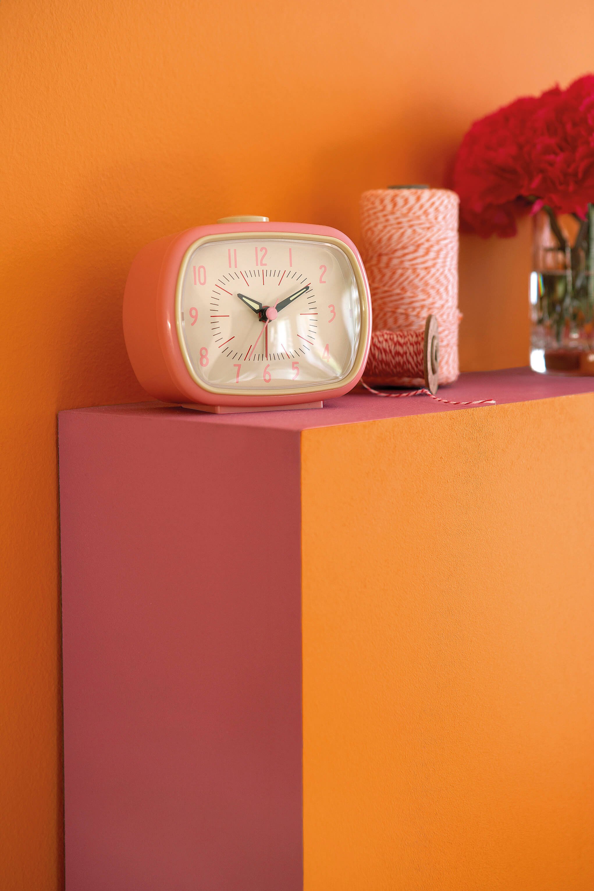
The 1960s didn't ease into colour — they arrived with it. Saturated orange, hot pink, citrus yellow and carmine red replaced the cautious post-war palette with something that refused to be ignored. In Chicago's north side vintage flats and rehabbed courtyard apartments, this fearless use of colour still lives in the bones of buildings that never got painted over.
Little Greene's 1960s palette captures the decade's most defining quality — the absolute confidence that colour was the point.

Brighton No. 203 is a soft natural green with the depth and nuance associated with Little Greene’s historic palette, bringing the restorative character of the landscape indoors.

Dorchester Pink No. 213 is a soft warm pink with the depth and nuance associated with Little Greene’s historic palette, adding warmth and lift without becoming overly bright.

Deep Space Blue No. 207 is a saturated midnight blue with a clean, modern intensity that brings depth without the heaviness of black.

Aquamarine - Deep No. 198 is a deep blue-green historically suited to layered schemes with pale and mid-tone browns.
Atomic Red No. 190 is an unapologetic primary red with the bold graphic confidence of 1970s decoration, perfect for expressive accents and statement joinery.

Tivoli No. 206 is a mid-tone heritage blue with the depth and nuance associated with Little Greene’s historic palette, bringing depth and clarity to both classic and contemporary rooms.

Carmine No. 189 is a mid-tone crimson red with the depth and nuance associated with Little Greene’s historic palette, adding a confident, cocooning character without feeling overly formal.

Hicks’ Blue No. 208 is a deep, inky blue with a tailored architectural character, creating a rich backdrop for artwork, warm metals and natural timber.

Marigold No. 209 is a mid-tone golden yellow with the depth and nuance associated with Little Greene’s historic palette, creating a sunlit atmosphere even in spaces with limited natural light.

Leather No. 191 is a mid-tone crimson red with the depth and nuance associated with Little Greene’s historic palette, adding a confident, cocooning character without feeling overly formal.

Trumpet No. 196 is a mid-tone golden yellow with a lively, theatrical confidence, casting a warm, optimistic glow across the room.
A Palette to Inspire
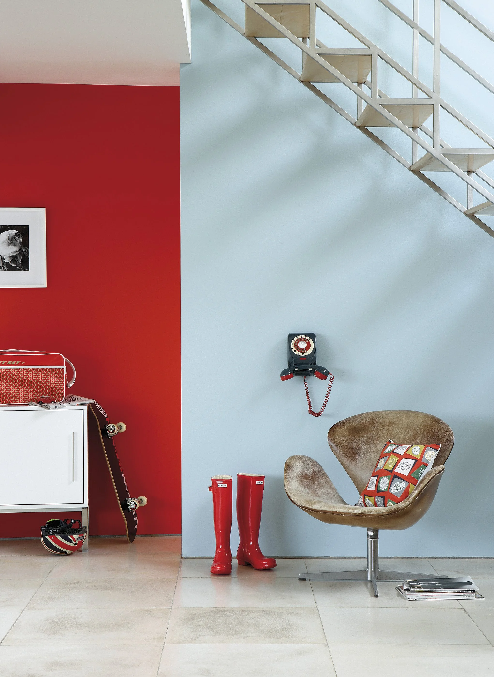

Walls:
Atomic Red 190

Walls:
Sky Blue 103

Accent Color:
Shallows 223