
Arts & Crafts Colours
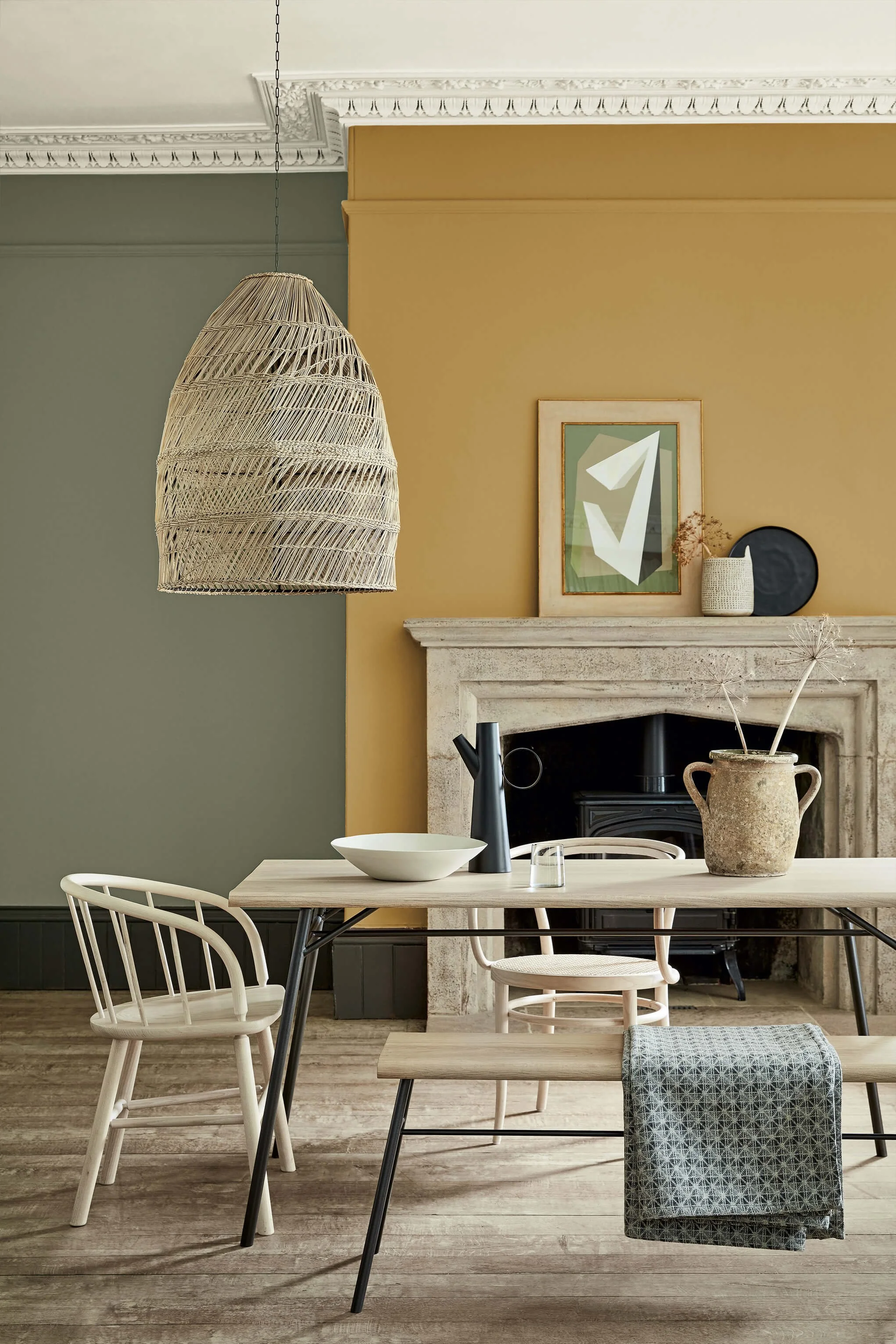
No American city embraced the Arts & Crafts movement more genuinely than Chicago. The bungalow belt — tens of thousands of homes stretching across the North and Northwest Sides — was the movement's largest single residential expression anywhere in the world. Warm terracottas, mossy greens, deep earthy browns, and muted golds were chosen deliberately: colours that looked like they came from the earth, because the philosophy demanded it.
Little Greene's Arts & Crafts palette is formulated from the same mineral pigments the original craftsmen specified — colours that cannot be replicated with modern synthetic substitutes. On a Chicago bungalow, the difference is visible from the curb.

Dark Brunswick Green No. 88 is a traditional near-black green with a polished, stately character, ideal for doors, cabinetry and exterior details.

Portland Stone - Pale No. 155 is a pale mineral neutral with the tactile character of historic mineral pigments, creating depth and warmth while allowing materials and furnishings to lead.

Light Bronze Green No. 123 is a rich earthy ochre with the depth and nuance associated with Little Greene’s historic palette, casting a warm, optimistic glow across the room.

Chocolate Colour No. 124 is a dramatic warm neutral with the comforting richness suggested by its culinary name, giving rooms an understated, beautifully layered foundation.

Portland Stone - Light No. 281 is a pale mineral neutral with the tactile character of historic mineral pigments, offering a quiet backdrop with enough character to avoid feeling flat.

Middle Buff No. 122 is a deep warm neutral with the depth and nuance associated with Little Greene’s historic palette, bringing a soft architectural structure to both modern and period spaces.
A Palette to Inspire
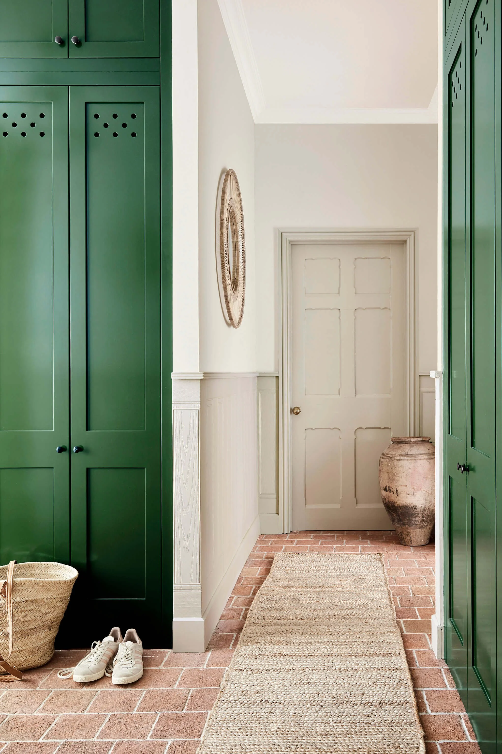

Cabinets:
Dark Brunswick Green 88

Walls
Portland Stone Light 128

Door & Wainscoting:
Portland Stone Pale 155