
-
White Paint Colours
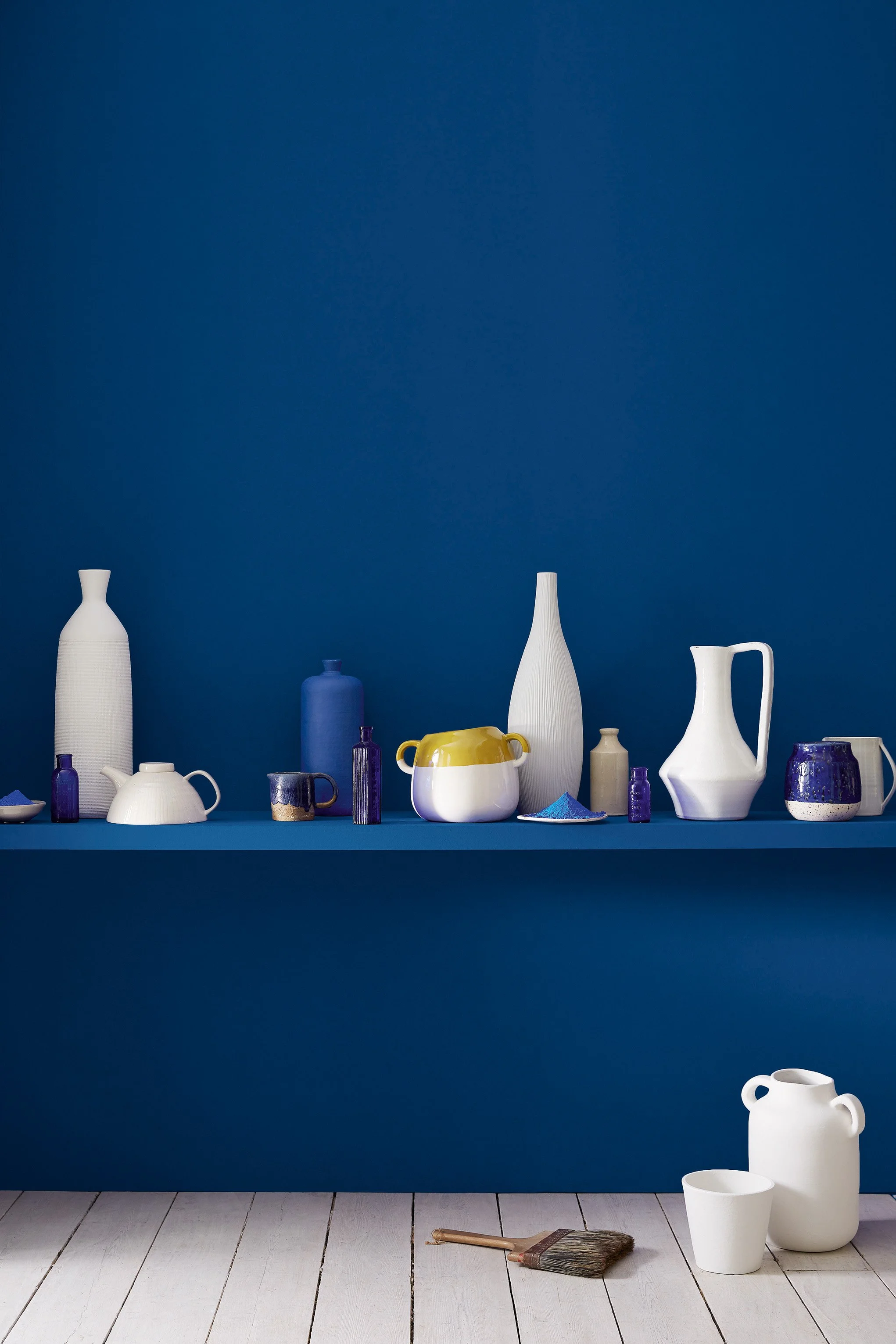
Blue is Heritage Home's most requested colour family, and the reason is simple: no other paint brand brings this level of pigment complexity to a colour so often treated as a flat, one-note choice. From the palest sky tones to blacks with real Georgian gravity, Little Greene's blues respond to Chicago's light in ways mass-produced paint never will.
Pale Blues
Pale blue is Heritage Home's most requested colour family, aand the most rewarding when chosen with care. Little Greene's pale blues are drawn from the mineral and sky pigments of British decorative tradition, with a complexity of undertone that mass-produced paint cannot approach. Consider light direction: Chicago's south and west-facing rooms benefit from the cooling character of pale blue. Bone China Blue and Delicate Blue are the most versatile starting points.

Bone China Blue - Mid No. 183 is a pale balanced white designed to layer effortlessly within tonal colour schemes, providing a luminous foundation for layered tonal schemes.

Delicate Blue No. 248 is a pale heritage blue with the depth and nuance associated with Little Greene’s historic palette, bringing depth and clarity to both classic and contemporary rooms.
Green-Based Blues
Blue-greens occupy a unique position in the palette — equally at home in contemporary Midwest apartments and the period rooms of Chicago's historic architecture. Air Force Blue combines beautifully with Pink Slip and French Grey for a scheme of real refinement. Developed from the aqua pigments of British decorative painting, these are the blues that make a room feel genuinely considered.

Hidey Hole No. 307 is a pale natural green with the depth and nuance associated with Little Greene’s historic palette, bringing the restorative character of the landscape indoors.

Harley Green No. 312 is a rich blue-green with the depth and nuance associated with Little Greene’s historic palette, bringing depth and clarity to both classic and contemporary rooms.

Brighton No. 203 is a soft natural green with the depth and nuance associated with Little Greene’s historic palette, bringing the restorative character of the landscape indoors.

Aquamarine - Pale No. 282 is a airy natural green with a clear, atmospheric quality, bringing the restorative character of the landscape indoors.

Aquamarine - Deep No. 198 is a deep blue-green historically suited to layered schemes with pale and mid-tone browns.

Aquamarine No. 138 is a soft natural green with a clear, atmospheric quality, adding natural depth to walls, cabinetry and architectural details.

Tea with Florence No. 310 is a deep blue-green with the depth and nuance associated with Little Greene’s historic palette, creating a poised backdrop that shifts beautifully with the light.

Marine Blue No. 95 is a deep, oceanic teal with a confident, enveloping quality that feels both historic and strikingly contemporary.

Canton No. 94 is a saturated teal with a jewel-like depth, bringing confidence and sophistication to cabinetry, dining rooms and dramatic walls.

Air Force Blue No. 260 is a confident heritage blue with a lively mid-tone depth, equally striking on walls, kitchen cabinetry and exterior joinery.
Muted Blues
The most liveable of the blues and is complex, calming and endlessly versatile. Celestial Blue, a blue-green of particular subtlety drawn from British mineral traditions, creates an atmosphere in living rooms and bedrooms that stronger blues cannot achieve. These are the shades that make a room feel as though it has always been exactly right — the quiet confidence of colours with three centuries of history behind them.

Grey Stone No. 276 is a mid-tone cool grey with the tactile character of historic mineral pigments, bringing architectural definition without the severity of a true black.

Celestial Blue No. 101 is a softly weathered blue discovered on a rare surviving colour card from 1807, with a beautifully restrained historic character.

Pale Wedgwood No. 249 is a soft heritage blue with the depth and nuance associated with Little Greene’s historic palette, creating a poised backdrop that shifts beautifully with the light.

Pale Lupin No. 278 is a deep heritage blue with the depth and nuance associated with Little Greene’s historic palette, creating a poised backdrop that shifts beautifully with the light.

Juniper Ash No. 115 is a deep atmospheric neutral with the tactile character of historic mineral pigments, giving walls and joinery a calm, architectural confidence.

James No. 108 is a mid-tone heritage blue with the depth and nuance associated with Little Greene’s historic palette, adding a composed, quietly distinctive note to an interior.

Etruria No. 326 is a deep heritage blue with the depth and nuance associated with Little Greene’s historic palette, adding a composed, quietly distinctive note to an interior.

Bone China Blue - Faint No. 325 is a soft blue-green designed to layer effortlessly within tonal colour schemes, adding a composed, quietly distinctive note to an interior.

Bone China Blue No. 107 is a soft, mineral blue with a delicate green undertone, creating a calm and quietly luminous backdrop.
Strong Blues
The blues for rooms that demand to be taken seriously. Royal Navy, Dock Blue and Basalt carry the pigment depth of Georgian English decorative tradition — the intimate, cocooning blues of the finest dining rooms and studies. For Chicago homeowners restoring period properties, these are the historically grounded shades that belong on woodwork and walls, and nowhere in the Midwest can you find them mixed with this quality.

Thai Sapphire No. 116 is a dramatic inky aubergine with the depth and nuance associated with Little Greene’s historic palette, bringing warmth, wit and a sense of occasion to a room.

Basalt No. 221 is a charismatic blue-black that reads almost black in low light, revealing a cool mineral undertone as daylight moves across the room.

Woad No. 251 is a deep heritage blue with a clear, atmospheric quality, bringing depth and clarity to both classic and contemporary rooms.

Tivoli No. 206 is a mid-tone heritage blue with the depth and nuance associated with Little Greene’s historic palette, bringing depth and clarity to both classic and contemporary rooms.

Smalt No. 255 is a rich heritage blue with a clear, atmospheric quality, giving walls and joinery a calm, architectural confidence.

Royal Navy No. 257 is a classic, saturated navy with an elegant depth that brings tailored sophistication to walls, cabinetry and exterior joinery.

Mazarine No. 256 is a rich heritage blue with the depth and nuance associated with Little Greene’s historic palette, creating a poised backdrop that shifts beautifully with the light.
Marine Blue No. 95 is a deep, oceanic teal with a confident, enveloping quality that feels both historic and strikingly contemporary.

Mambo No. 112 is a mid-tone heritage blue with a clear, atmospheric quality, adding a composed, quietly distinctive note to an interior.

Hicks’ Blue No. 208 is a deep, inky blue with a tailored architectural character, creating a rich backdrop for artwork, warm metals and natural timber.

Dock Blue No. 252 is a rich heritage blue with the depth and nuance associated with Little Greene’s historic palette, bringing depth and clarity to both classic and contemporary rooms.

Deep Space Blue No. 207 is a saturated midnight blue with a clean, modern intensity that brings depth without the heaviness of black.

Blue Verditer No. 104 is a mid-tone heritage blue with the depth and nuance associated with Little Greene’s historic palette, giving walls and joinery a calm, architectural confidence.

Sky Blue No. 103 is a luminous historic blue, made with Prussian blue pigments to capture the feeling of a clear summer sky and especially beautiful in light-filled rooms.
Air Force Blue No. 260 is a confident heritage blue with a lively mid-tone depth, equally striking on walls, kitchen cabinetry and exterior joinery.
A Palette to Inspire
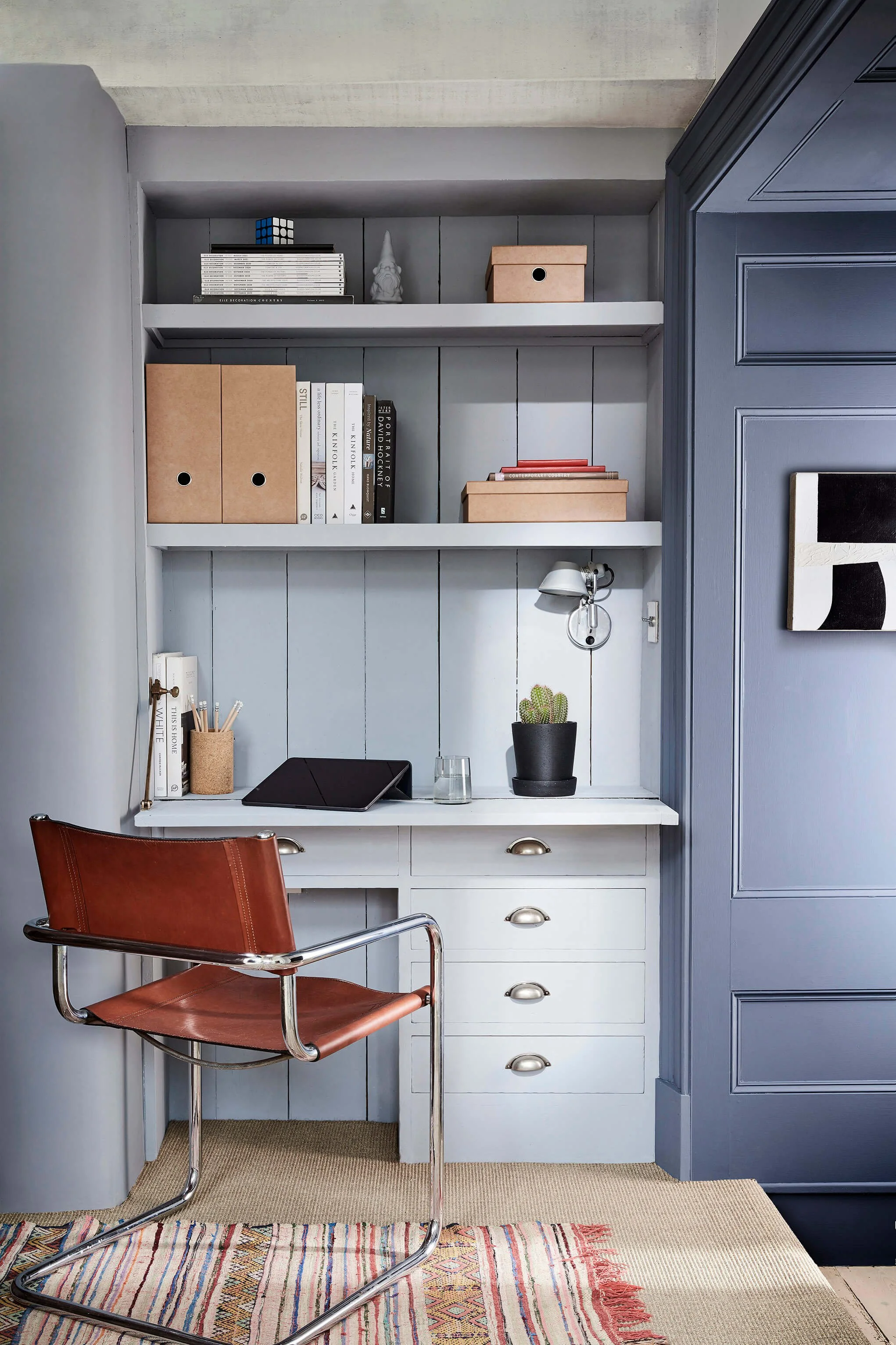

Walls:
Obscura (327)
Walls:
Juniper Ash (115)

Accent:
Arras (316)
Bone China Blue - Pale No. 182 is a pale natural green designed to layer effortlessly within tonal colour schemes, creating a grounded, enveloping backdrop for layered interiors.