
Georgian Paint Colours
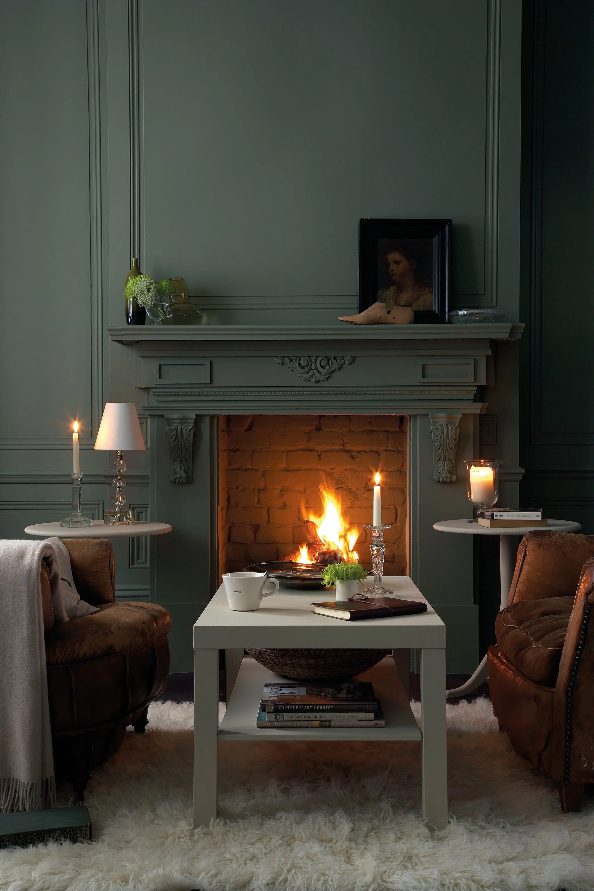
Before Chicago was Chicago, Georgian proportion was already setting the standard for how civilised people lived. Flat whites, soft stone tones, and the occasional daring blue-green defined an era that believed beauty lived in symmetry. Chicago's earliest Federal-style homes and North Shore estates still carry this palette in their bones — understated, correct, and quietly confident.
Little Greene's Georgian range is drawn directly from 18th century pigment records, giving you historically accurate colours that no mass-produced alternative can replicate.

Sky Blue No. 103 is a luminous historic blue, made with Prussian blue pigments to capture the feeling of a clear summer sky and especially beautiful in light-filled rooms.

Boringdon Green No. 295 is a mid-tone yellow-green with the depth and nuance associated with Little Greene’s historic palette, adding natural depth to walls, cabinetry and architectural details.

Scullery No. 318 is a rich earthy ochre designed to layer effortlessly within tonal colour schemes, adding warmth and lift without becoming overly bright.

Chocolate Colour No. 124 is a dramatic warm neutral with the comforting richness suggested by its culinary name, giving rooms an understated, beautifully layered foundation.

Tea with Florence No. 310 is a deep blue-green with the depth and nuance associated with Little Greene’s historic palette, creating a poised backdrop that shifts beautifully with the light.

Olive Colour No. 72 is a dramatic mellow yellow with an organic, garden-inspired character, casting a warm, optimistic glow across the room.

Dark Lead Colour No. 118 is a deep warm grey with the tactile character of historic mineral pigments, bringing architectural definition without the severity of a true black.

Windmill Lane No. 296 is a mid-tone natural green with the depth and nuance associated with Little Greene’s historic palette, adding natural depth to walls, cabinetry and architectural details.

Split Pink No. 341 is a mid-tone warm pink, lending walls and woodwork a rich, memorable presence.

Mid Lead Colour No. 114 is a mid-tone warm grey with the tactile character of historic mineral pigments, bringing architectural definition without the severity of a true black.

Pearl Colour No. 100 is a pale yellow-green with the depth and nuance associated with Little Greene’s historic palette, bringing the restorative character of the landscape indoors.

Mochi No. 344 is a mid-tone warm neutral with the comforting richness suggested by its culinary name, creating depth and warmth while allowing materials and furnishings to lead.

Whitening No. 41 is a airy mineral white with the depth and nuance associated with Little Greene’s historic palette, softening a room while keeping it light, calm and considered.

Book Room Green No. 322 is a mellow, parchment-toned green-neutral that brings the warmth and intimacy of a well-loved library to an interior.

White Lead No. 74 is a warm historic white with a soft, chalky depth, ideal for creating quiet tonal schemes without the glare of brilliant white.

Stone-Pale-Warm No. 34 is a pale mineral neutral with the tactile character of historic mineral pigments, creating a sunlit atmosphere even in spaces with limited natural light.

Invisible Green No. 56 is a near-black olive created to disappear into the landscape, making it a beautifully discreet choice for exterior woodwork and garden structures.

Lead Colour No. 117 is a mid-tone warm grey with the tactile character of historic mineral pigments, offering a composed, versatile foundation for colour and natural materials.
A Palette to Inspire
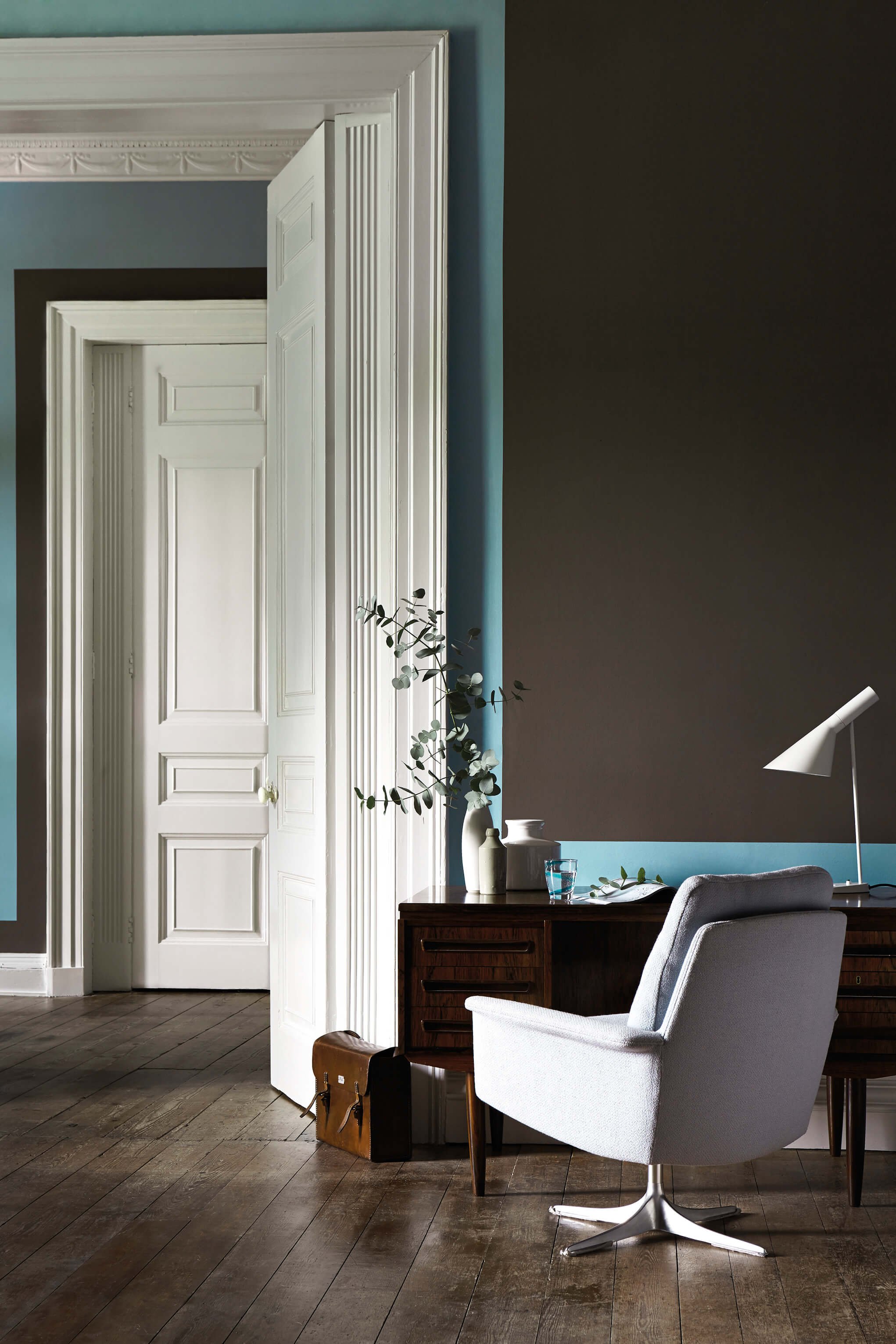


Walls:
Scullery 138

Decorative Trim:
Sky Blue 103
Trim:
Whitening 41