
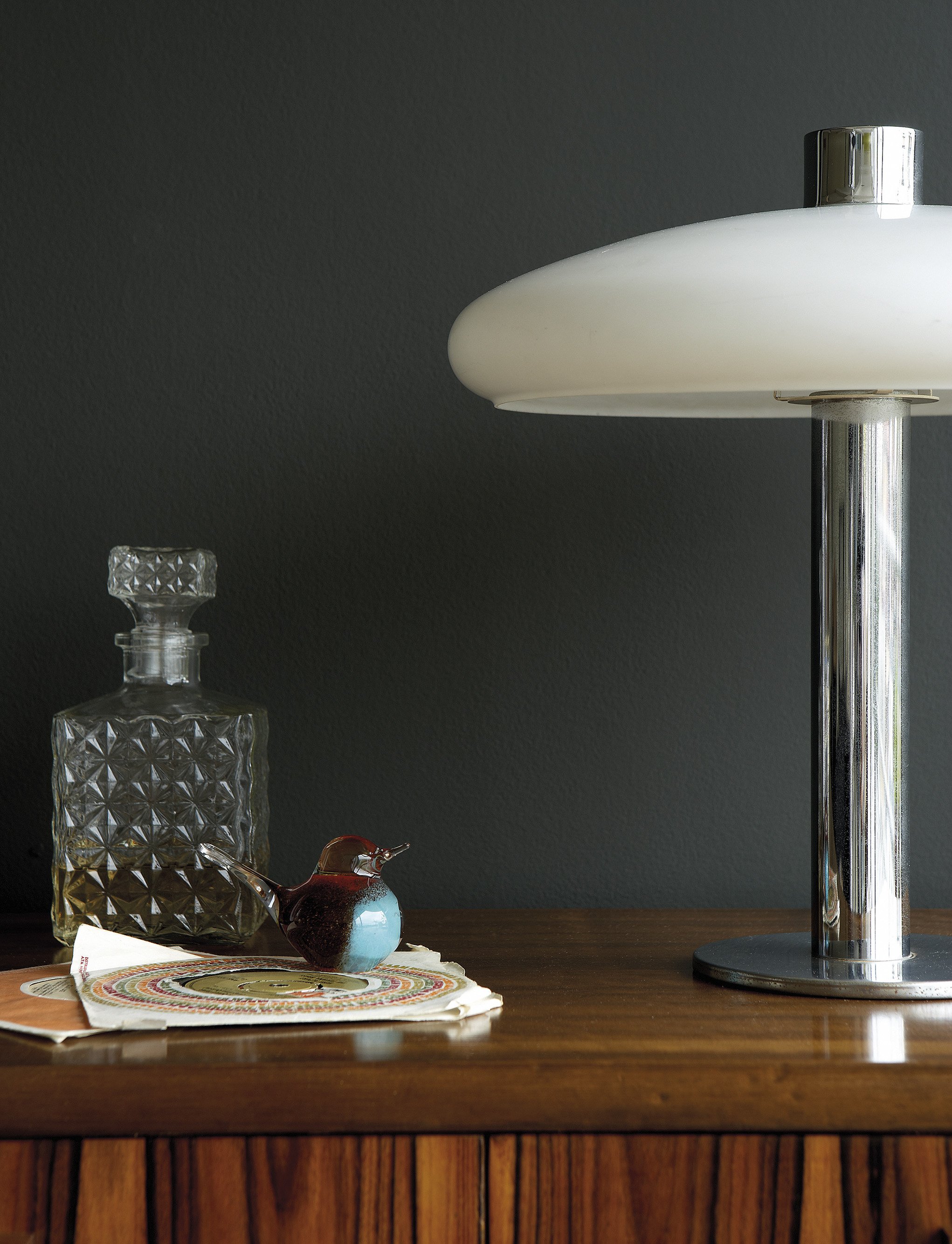
Interwar Colours
Chicago went vertical in the 1920s and dressed its Art Deco interiors to match. Dark, considered, and quietly glamorous — the palette of the era was charcoal, warm black, aged brass, and deep tobacco. These are the colours of a city that knew how to hold a cocktail and make a room feel like it meant something.

Air Force Blue No. 260 is a confident heritage blue with a lively mid-tone depth, equally striking on walls, kitchen cabinetry and exterior joinery.

Harley Green No. 312 is a rich blue-green with the depth and nuance associated with Little Greene’s historic palette, bringing depth and clarity to both classic and contemporary rooms.

Bone China Blue No. 107 is a soft, mineral blue with a delicate green undertone, creating a calm and quietly luminous backdrop.

Goblin No. 311 is a rich blue-green with the depth and nuance associated with Little Greene’s historic palette, feeling restful by day and richly atmospheric after dark.

Mid Azure Green No. 96 is a dramatic natural green with the depth and nuance associated with Little Greene’s historic palette, feeling restful by day and richly atmospheric after dark.

Beauvais Lilac No. 29 is a pale warm lilac with the depth and nuance associated with Little Greene’s historic palette, adding warmth and lift without becoming overly bright.

Hidey Hole No. 307 is a pale natural green with the depth and nuance associated with Little Greene’s historic palette, bringing the restorative character of the landscape indoors.

Light Beauvais No. 323 is a pale earthy ochre designed to layer effortlessly within tonal colour schemes, bringing mellow light and understated energy to an interior.

Middle Buff No. 122 is a deep warm neutral with the depth and nuance associated with Little Greene’s historic palette, bringing a soft architectural structure to both modern and period spaces.
A Palette to Inspire
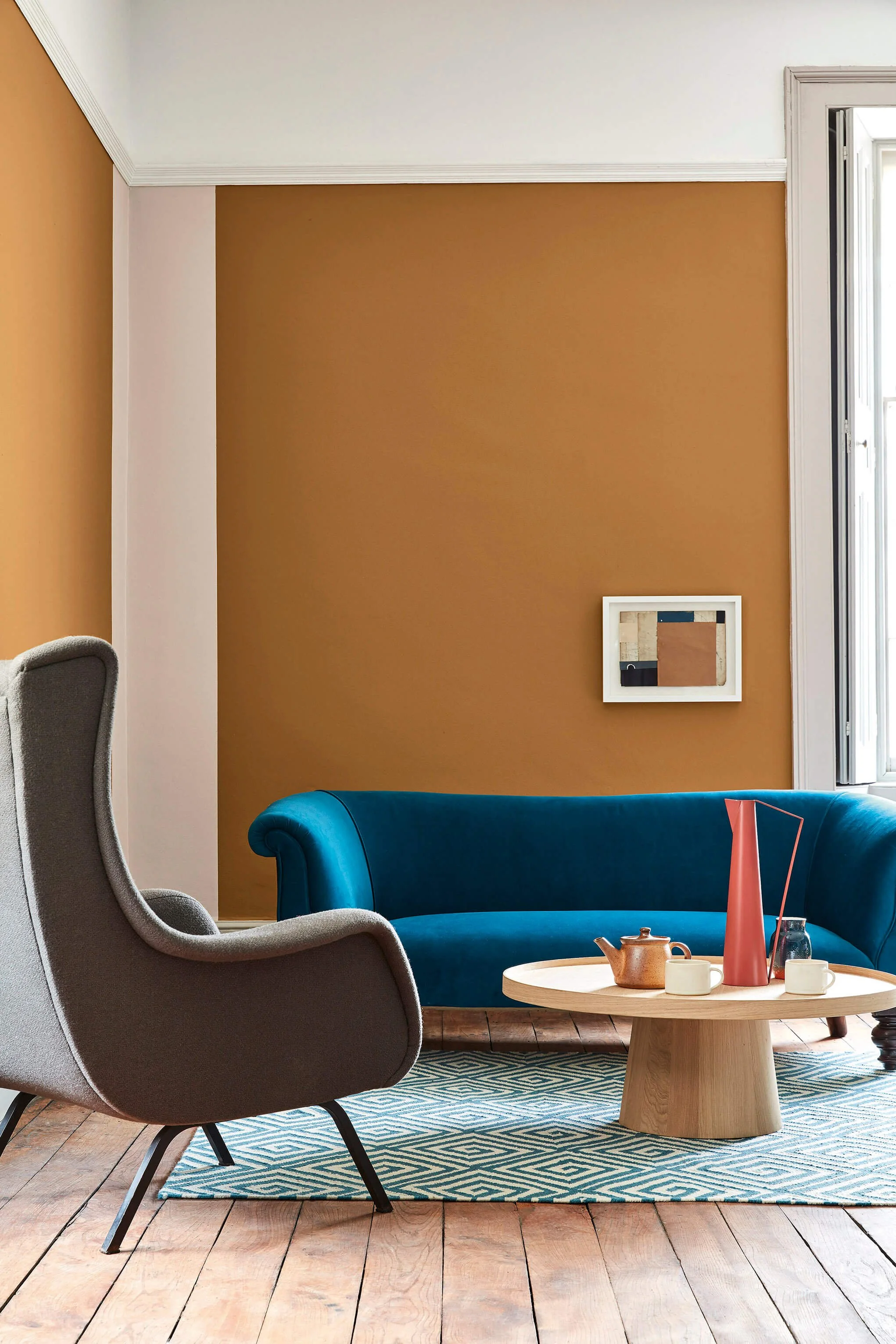

Walls:
Middle Buff 122

Wall Accent:
Light Peachblossom 3

Ceiling
Whitening 41