
-
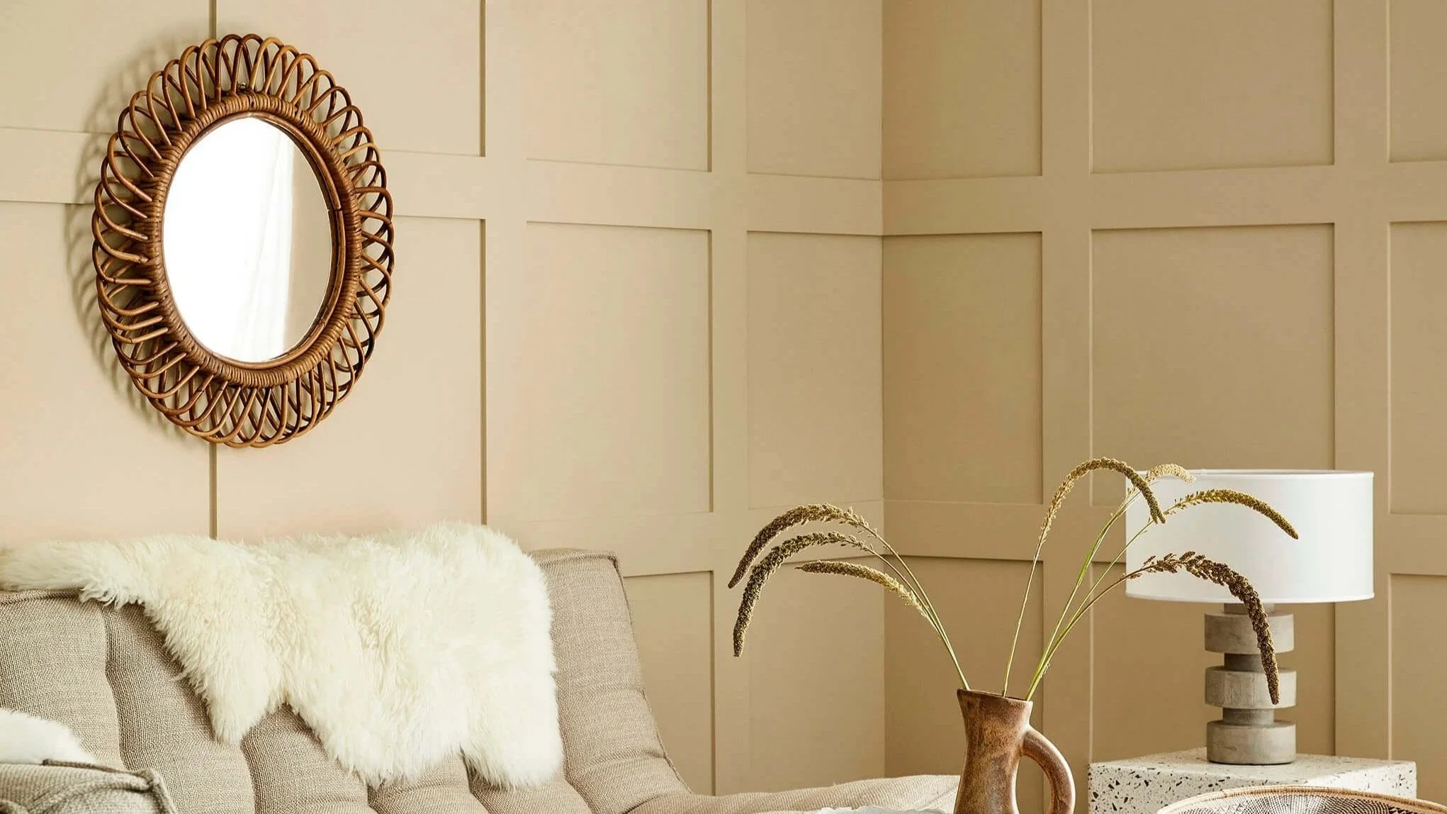
Neutral Paint Colours
Neutral doesn't mean plain. Little Greene's neutrals are built from real pigment complexity — warm greiges, green-touched stones, pink-tinted softness and grounding darks — each shifting subtly through the day in a way flat, mass-market neutrals simply can't. For Chicago's period homes and contemporary apartments alike, these are the shades Heritage Home reaches for as the backbone of a considered scheme.
Warm Neutrals
Warm neutrals bring softness to North Side interiors without tipping cold. Correct for living rooms, bedrooms, and any Chicago greystone where natural light runs low in winter

Travertine - Mid No. 273 is a pale mineral neutral with the tactile character of historic mineral pigments, creating a sunlit atmosphere even in spaces with limited natural light.

Travertine - Light No. 272 is a pale mineral neutral with the tactile character of historic mineral pigments, casting a warm, optimistic glow across the room.

Travertine No. 319 is a soft mineral neutral with the tactile character of historic mineral pigments, adding warmth and lift without becoming overly bright.

Stone-Pale-Warm No. 34 is a pale mineral neutral with the tactile character of historic mineral pigments, creating a sunlit atmosphere even in spaces with limited natural light.

Stock No. 37 is a airy mellow yellow with the depth and nuance associated with Little Greene’s historic palette, creating a sunlit atmosphere even in spaces with limited natural light.

Silent White - Pale No. 328 is a airy mineral white designed to layer effortlessly within tonal colour schemes, bringing gentle clarity to walls, ceilings and woodwork.

Silent White - Deep No. 331 is a pale mineral white designed to layer effortlessly within tonal colour schemes, creating a nuanced alternative to a stark, brilliant white.

Silent White No. 329 is a airy mineral white designed to layer effortlessly within tonal colour schemes, bringing gentle clarity to walls, ceilings and woodwork.
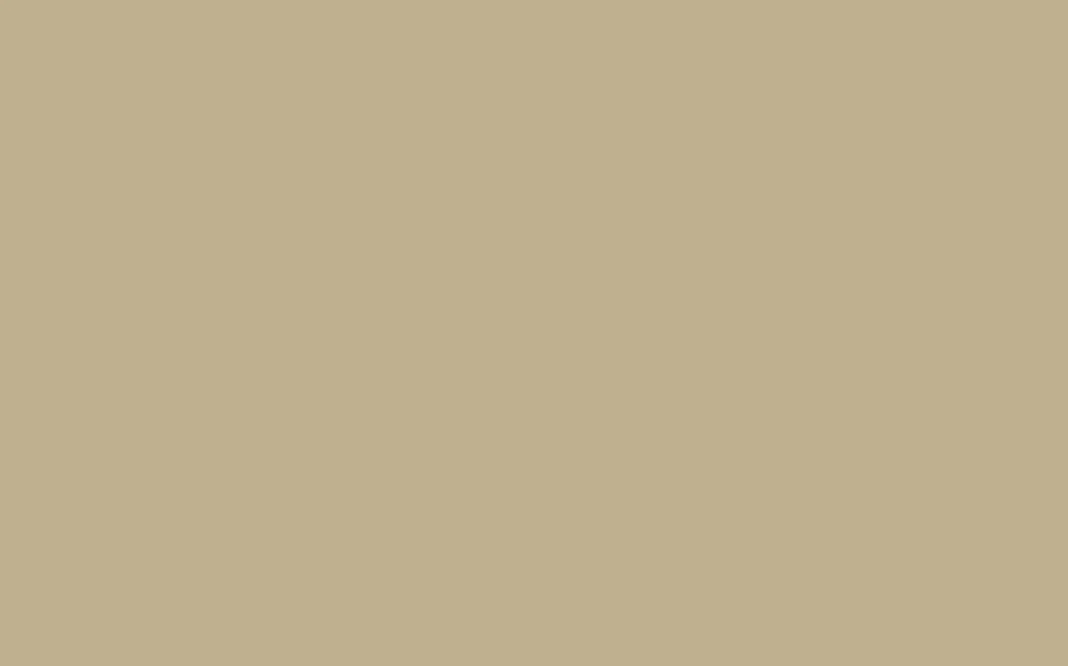
Roman Plaster No. 31 is a mid-tone mineral neutral with the tactile character of historic mineral pigments, casting a warm, optimistic glow across the room.

Linen Wash No. 33 is a airy atmospheric neutral with the tactile character of historic mineral pigments, creating a sunlit atmosphere even in spaces with limited natural light.

Julie's Dream No. 26 is a pale earthy ochre with the depth and nuance associated with Little Greene’s historic palette, adding warmth and lift without becoming overly bright.

Hollyhock No. 25 is a airy earthy ochre with the depth and nuance associated with Little Greene’s historic palette, bringing mellow light and understated energy to an interior.

First Light No. 49 is a airy mellow yellow with the depth and nuance associated with Little Greene’s historic palette, creating a sunlit atmosphere even in spaces with limited natural light.

Clay - Pale No. 152 is a pale mineral neutral with the tactile character of historic mineral pigments, casting a warm, optimistic glow across the room.

Clay - Mid No. 153 is a pale mineral neutral with the tactile character of historic mineral pigments, adding warmth and lift without becoming overly bright.

Clay No. 39 is a soft mineral neutral with the tactile character of historic mineral pigments, bringing mellow light and understated energy to an interior.

Hammock No. 38 is a soft earthy ochre with the depth and nuance associated with Little Greene’s historic palette, bringing mellow light and understated energy to an interior.

Mushroom No. 142 is a soft atmospheric neutral with the depth and nuance associated with Little Greene’s historic palette, offering a quiet backdrop with enough character to avoid feeling flat.
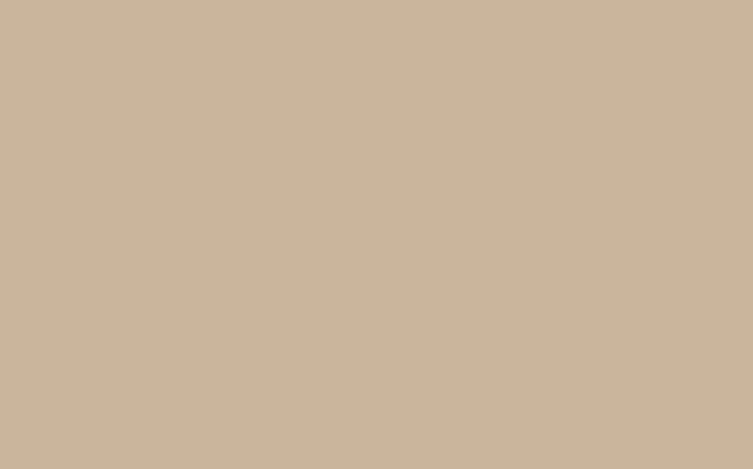
Lute No. 317 is a soft mineral neutral designed to layer effortlessly within tonal colour schemes, bringing a soft architectural structure to both modern and period spaces.

Joanna No. 130 is a pale balanced neutral with the depth and nuance associated with Little Greene’s historic palette, giving rooms an understated, beautifully layered foundation.

Bath Stone No. 64 is a mid-tone mineral neutral with the tactile character of historic mineral pigments, creating depth and warmth while allowing materials and furnishings to lead.
Grey-Based Neutrals & Greiges
Grey-based neutrals and greiges — the workhorse shades for historic home renovation. French Grey and Portland Stone read true against original millwork and plaster.

Slaked Lime - Mid No. 149 is an airy warm grey with the tactile character of historic mineral pigments, bringing architectural definition without the severity of a true black.

Slaked Lime No. 105 is a warm, chalky white with the soft mineral character of traditional limewash, creating a gentle and timeless backdrop.

French Grey - Pale No. 161 is a pale warm grey designed to layer effortlessly within tonal colour schemes, bringing architectural definition without the severity of a true black.

French Grey - Mid No. 162 is a pale warm grey designed to layer effortlessly within tonal colour schemes, creating a tailored backdrop that responds subtly to changing light.
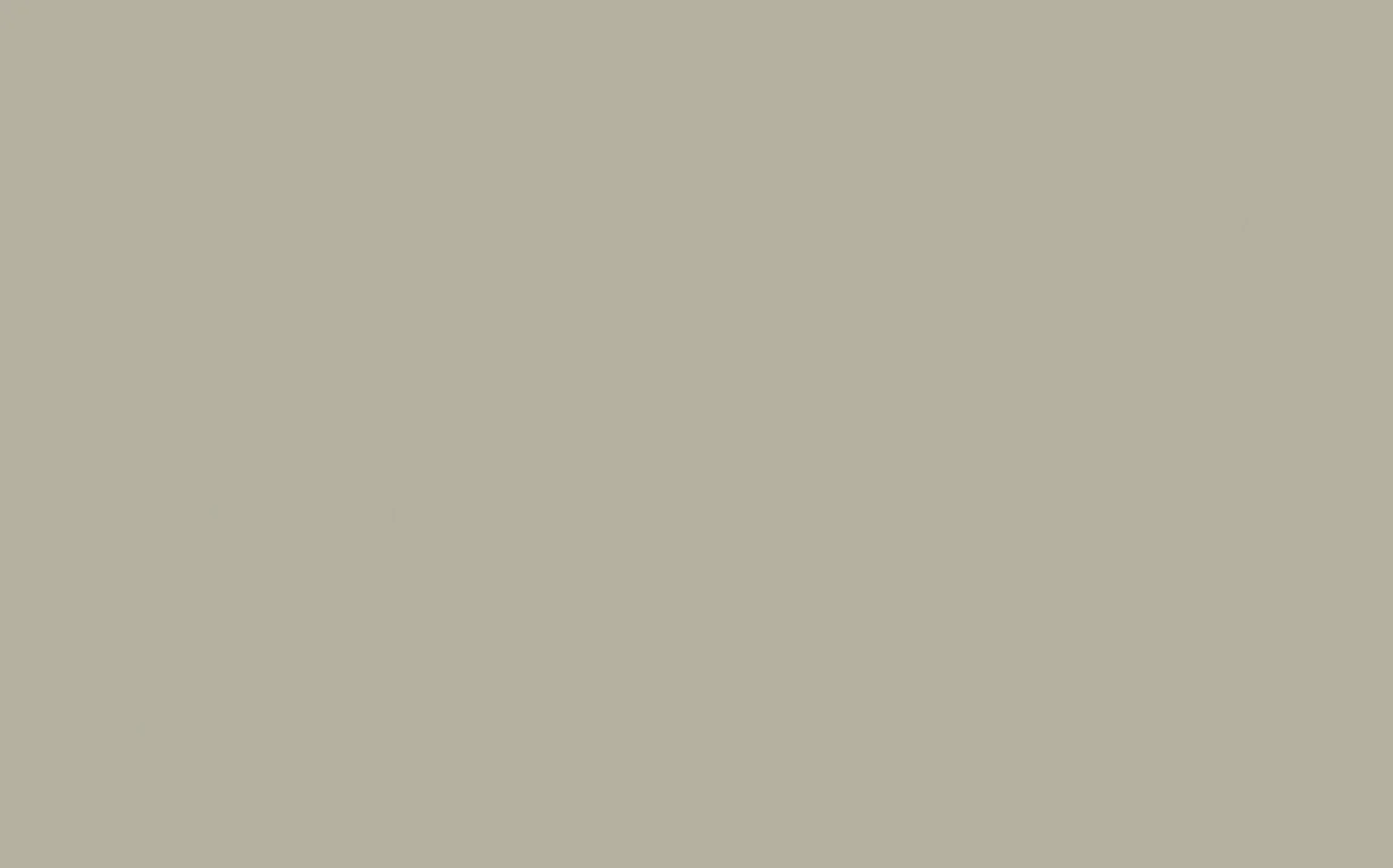
French Grey - Dark No. 163 is a mid-tone warm grey designed to layer effortlessly within tonal colour schemes, offering a composed, versatile foundation for colour and natural materials.

French Grey No. 113 is a serene, timeless neutral with subtle green undertones, equally at home in elegant period rooms and clean contemporary interiors.

Rolling Fog - Pale No. 158 is a pale atmospheric neutral designed to layer effortlessly within tonal colour schemes, casting a warm, optimistic glow across the room.

Slaked Lime - Deep No. 150 is a soft warm neutral with the tactile character of historic mineral pigments, bringing a soft architectural structure to both modern and period spaces.

Slaked Lime - Dark No. 151 is a soft warm neutral with the tactile character of historic mineral pigments, bringing a soft architectural structure to both modern and period spaces.
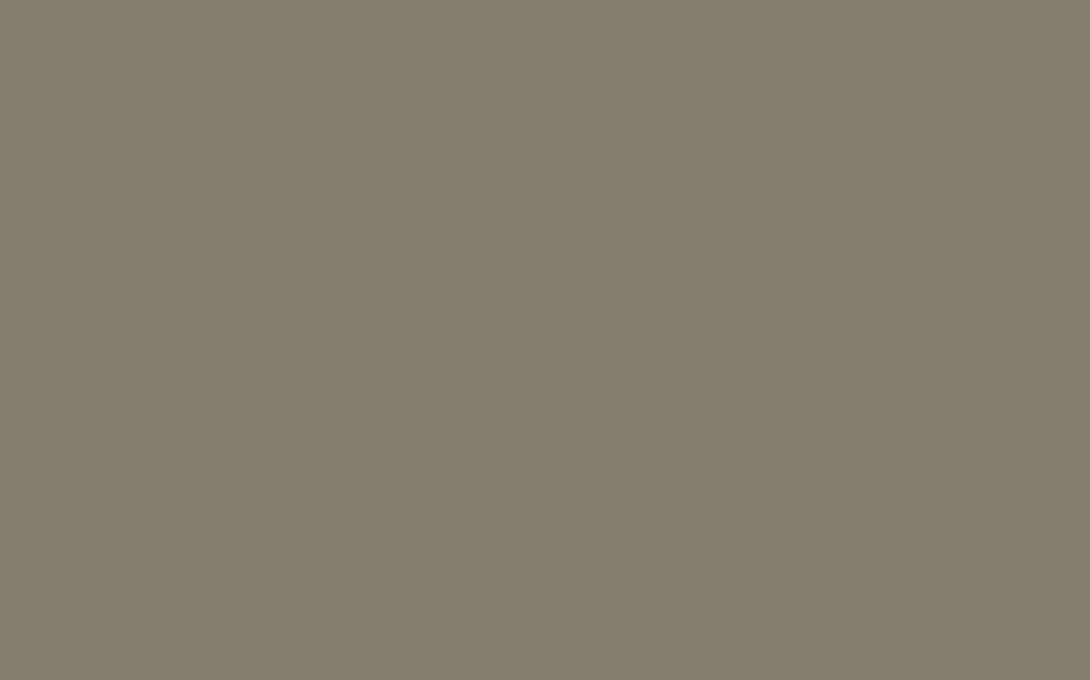
Silt No. 40 is a deep atmospheric neutral with the depth and nuance associated with Little Greene’s historic palette, giving rooms an understated, beautifully layered foundation.

Rolling Fog - Light No. 271 is a pale atmospheric neutral designed to layer effortlessly within tonal colour schemes, offering a quiet backdrop with enough character to avoid feeling flat.

Rolling Fog - Dark No. 160 is a mid-tone atmospheric neutral designed to layer effortlessly within tonal colour schemes, creating depth and warmth while allowing materials and furnishings to lead.

Rolling Fog No. 143 is a soft atmospheric neutral with the depth and nuance associated with Little Greene’s historic palette, giving rooms an understated, beautifully layered foundation.

Portland Stone - Pale No. 155 is a pale mineral neutral with the tactile character of historic mineral pigments, creating depth and warmth while allowing materials and furnishings to lead.

Portland Stone - Light No. 281 is a pale mineral neutral with the tactile character of historic mineral pigments, offering a quiet backdrop with enough character to avoid feeling flat.
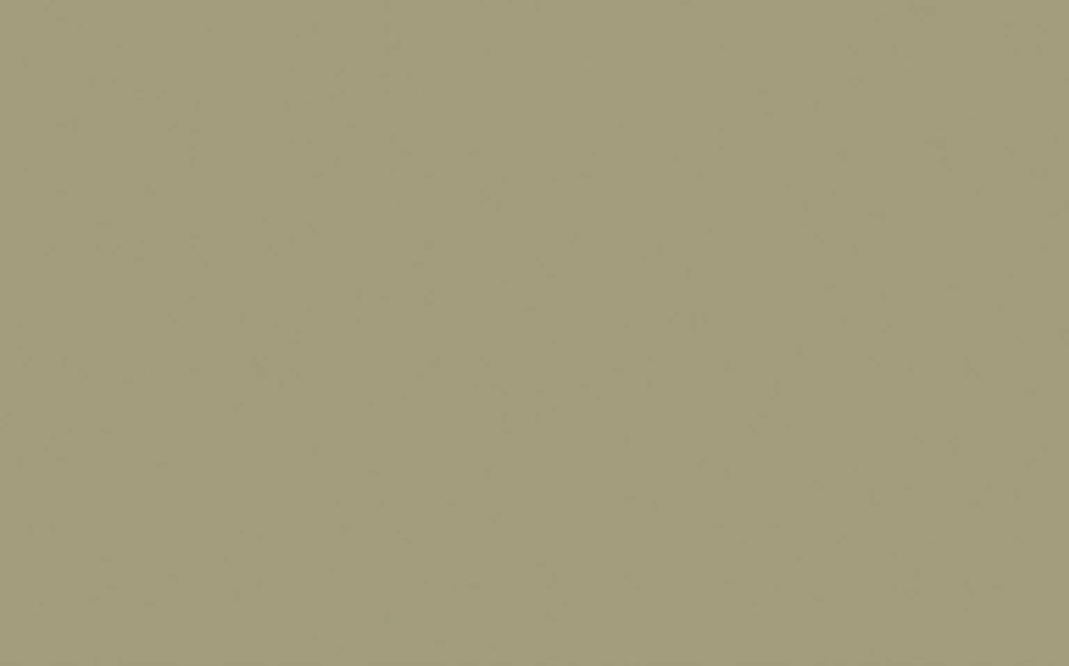
Portland Stone - Dark No. 157 is a mid-tone mineral neutral with the tactile character of historic mineral pigments, giving rooms an understated, beautifully layered foundation.

Portland Stone No. 77 is a soft mineral neutral with the tactile character of historic mineral pigments, offering a quiet backdrop with enough character to avoid feeling flat.
Joanna No. 130 is a pale balanced neutral with the depth and nuance associated with Little Greene’s historic palette, giving rooms an understated, beautifully layered foundation.
Green-Based Neutrals
Green-based neutrals for a quieter, natural palette — made by hand in small batches, chosen for rooms that want calm over contrast.

Pearl Colour-Pale No. 167 is a pale yellow-green designed to layer effortlessly within tonal colour schemes, bringing the restorative character of the landscape indoors.

Pearl Colour-Mid No. 168 is a pale yellow-green designed to layer effortlessly within tonal colour schemes, feeling restful by day and richly atmospheric after dark.

Pearl Colour-Dark No. 169 is a soft yellow-green designed to layer effortlessly within tonal colour schemes, feeling restful by day and richly atmospheric after dark.

Pearl Colour No. 100 is a pale yellow-green with the depth and nuance associated with Little Greene’s historic palette, bringing the restorative character of the landscape indoors.
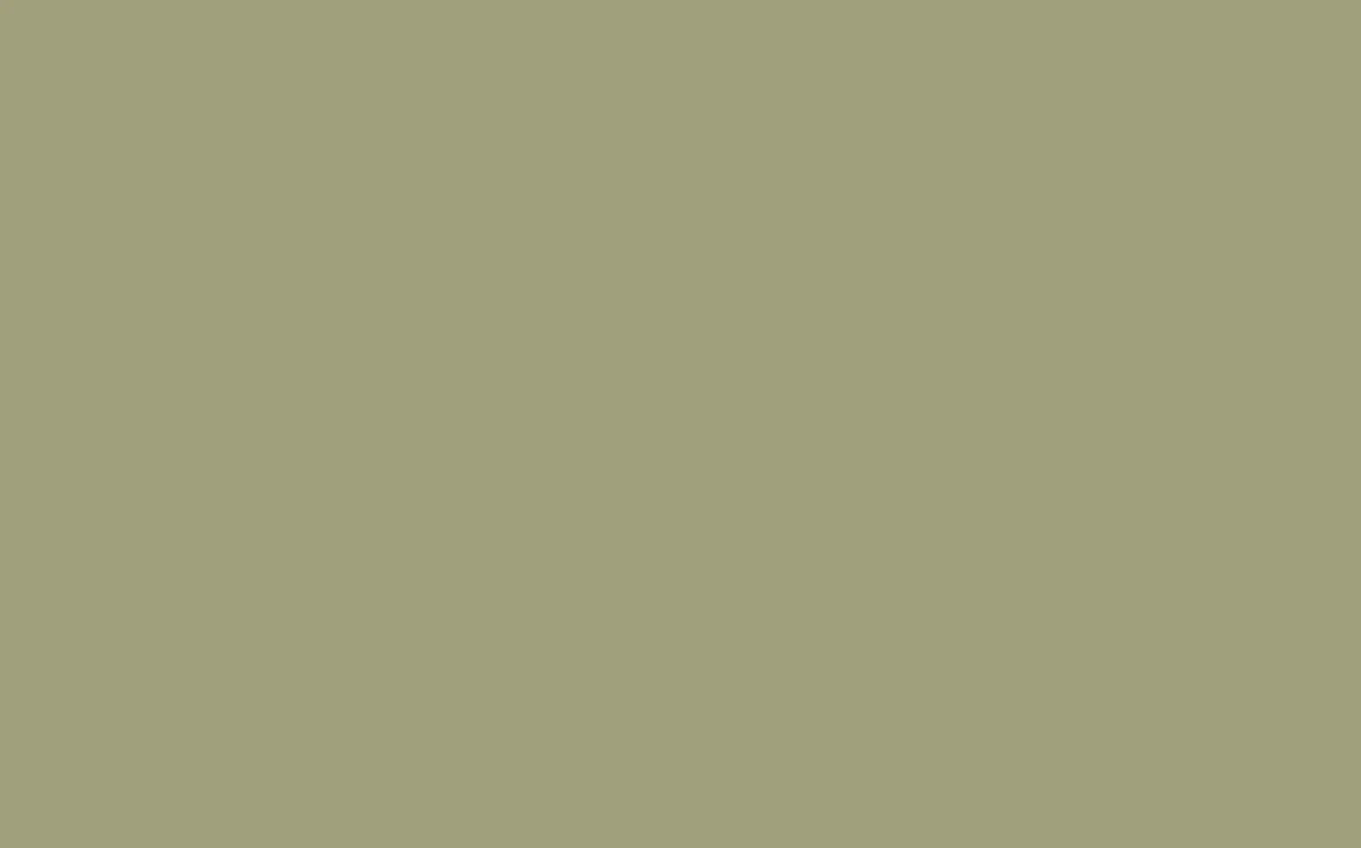
Normandy Grey No. 79 is a mid-tone warm grey with the depth and nuance associated with Little Greene’s historic palette, offering a composed, versatile foundation for colour and natural materials.

Green Stone - Pale No. 268 is a pale mineral neutral with the tactile character of historic mineral pigments, creating a sunlit atmosphere even in spaces with limited natural light.

Tracery II No. 78 is a soft warm neutral with the depth and nuance associated with Little Greene’s historic palette, giving rooms an understated, beautifully layered foundation.
Portland Stone - Pale No. 155 is a pale mineral neutral with the tactile character of historic mineral pigments, creating depth and warmth while allowing materials and furnishings to lead.
Portland Stone - Dark No. 157 is a mid-tone mineral neutral with the tactile character of historic mineral pigments, giving rooms an understated, beautifully layered foundation.
Portland Stone No. 77 is a soft mineral neutral with the tactile character of historic mineral pigments, offering a quiet backdrop with enough character to avoid feeling flat.

Green Stone - Light No. 269 is a pale mineral neutral with the tactile character of historic mineral pigments, giving rooms an understated, beautifully layered foundation.

Green Stone No. 270 is a soft mineral neutral with the tactile character of historic mineral pigments, bringing a soft architectural structure to both modern and period spaces.

Book Room Green No. 322 is a mellow, parchment-toned green-neutral that brings the warmth and intimacy of a well-loved library to an interior.
Pink-Based Neutrals
Pink-based neutrals, from a whisper of warmth to full character. Come see these in the showroom — pink undertones shift more than any other neutral depending on Chicago's daylight.
Roman Plaster No. 31 is a mid-tone mineral neutral with the tactile character of historic mineral pigments, casting a warm, optimistic glow across the room.

Light Beauvais No. 323 is a pale earthy ochre designed to layer effortlessly within tonal colour schemes, bringing mellow light and understated energy to an interior.
Julie's Dream No. 26 is a pale earthy ochre with the depth and nuance associated with Little Greene’s historic palette, adding warmth and lift without becoming overly bright.

Ferdinand No. 313 is a airy earthy ochre designed to layer effortlessly within tonal colour schemes, bringing mellow light and understated energy to an interior.

Dorchester Pink No. 213 is a soft warm pink with the depth and nuance associated with Little Greene’s historic palette, adding warmth and lift without becoming overly bright.

China Clay - Mid No. 176 is a pale mineral neutral with the tactile character of historic mineral pigments, creating a sunlit atmosphere even in spaces with limited natural light.

China Clay No. 1 is a airy mineral neutral with the tactile character of historic mineral pigments, casting a warm, optimistic glow across the room.

Castell Pink No. 314 is a soft warm pink designed to layer effortlessly within tonal colour schemes, bringing mellow light and understated energy to an interior.

Beauvais Lilac No. 29 is a pale warm lilac with the depth and nuance associated with Little Greene’s historic palette, adding warmth and lift without becoming overly bright.
Rolling Fog - Pale No. 158 is a pale atmospheric neutral designed to layer effortlessly within tonal colour schemes, casting a warm, optimistic glow across the room.
Hammock No. 38 is a soft earthy ochre with the depth and nuance associated with Little Greene’s historic palette, bringing mellow light and understated energy to an interior.
Rolling Fog - Light No. 271 is a pale atmospheric neutral designed to layer effortlessly within tonal colour schemes, offering a quiet backdrop with enough character to avoid feeling flat.
Rolling Fog - Dark No. 160 is a mid-tone atmospheric neutral designed to layer effortlessly within tonal colour schemes, creating depth and warmth while allowing materials and furnishings to lead.
Rolling Fog No. 143 is a soft atmospheric neutral with the depth and nuance associated with Little Greene’s historic palette, giving rooms an understated, beautifully layered foundation.
Mushroom No. 142 is a soft atmospheric neutral with the depth and nuance associated with Little Greene’s historic palette, offering a quiet backdrop with enough character to avoid feeling flat.

China Clay - Deep No. 177 is a soft mineral neutral with the tactile character of historic mineral pigments, offering a quiet backdrop with enough character to avoid feeling flat.
China Clay - Dark No. 178 is a soft mineral neutral with the tactile character of historic mineral pigments, giving rooms an understated, beautifully layered foundation.
Dark Neutrals
Dark neutrals for cocooning a room — dining rooms, studies, and entryways in period Chicago homes take these particularly well.
Slaked Lime - Mid No. 149 is an airy warm grey with the tactile character of historic mineral pigments, bringing architectural definition without the severity of a true black.
Slaked Lime No. 105 is a warm, chalky white with the soft mineral character of traditional limewash, creating a gentle and timeless backdrop.
French Grey - Pale No. 161 is a pale warm grey designed to layer effortlessly within tonal colour schemes, bringing architectural definition without the severity of a true black.
French Grey - Mid No. 162 is a pale warm grey designed to layer effortlessly within tonal colour schemes, creating a tailored backdrop that responds subtly to changing light.
French Grey - Dark No. 163 is a mid-tone warm grey designed to layer effortlessly within tonal colour schemes, offering a composed, versatile foundation for colour and natural materials.
French Grey No. 113 is a serene, timeless neutral with subtle green undertones, equally at home in elegant period rooms and clean contemporary interiors.
Rolling Fog - Pale No. 158 is a pale atmospheric neutral designed to layer effortlessly within tonal colour schemes, casting a warm, optimistic glow across the room.
Slaked Lime - Deep No. 150 is a soft warm neutral with the tactile character of historic mineral pigments, bringing a soft architectural structure to both modern and period spaces.
Slaked Lime - Dark No. 151 is a soft warm neutral with the tactile character of historic mineral pigments, bringing a soft architectural structure to both modern and period spaces.
Silt No. 40 is a deep atmospheric neutral with the depth and nuance associated with Little Greene’s historic palette, giving rooms an understated, beautifully layered foundation.
Rolling Fog - Light No. 271 is a pale atmospheric neutral designed to layer effortlessly within tonal colour schemes, offering a quiet backdrop with enough character to avoid feeling flat.
Rolling Fog - Dark No. 160 is a mid-tone atmospheric neutral designed to layer effortlessly within tonal colour schemes, creating depth and warmth while allowing materials and furnishings to lead.
Rolling Fog No. 143 is a soft atmospheric neutral with the depth and nuance associated with Little Greene’s historic palette, giving rooms an understated, beautifully layered foundation.
Portland Stone - Pale No. 155 is a pale mineral neutral with the tactile character of historic mineral pigments, creating depth and warmth while allowing materials and furnishings to lead.
Portland Stone - Light No. 281 is a pale mineral neutral with the tactile character of historic mineral pigments, offering a quiet backdrop with enough character to avoid feeling flat.
Portland Stone - Dark No. 157 is a mid-tone mineral neutral with the tactile character of historic mineral pigments, giving rooms an understated, beautifully layered foundation.
Portland Stone No. 77 is a soft mineral neutral with the tactile character of historic mineral pigments, offering a quiet backdrop with enough character to avoid feeling flat.
Joanna No. 130 is a pale balanced neutral with the depth and nuance associated with Little Greene’s historic palette, giving rooms an understated, beautifully layered foundation.
A Palette to Inspire
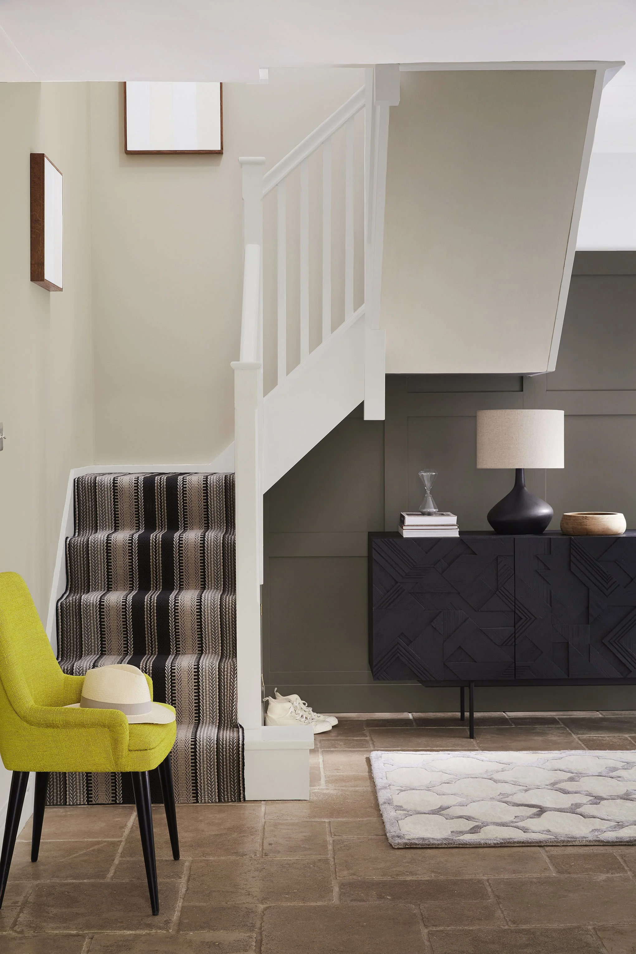

Walls:
Rolling Fog - Pale (158)

Walls:
Rolling Fog (143)

Accent Wall:
Attic II (144)
White Lead No. 74 is a warm historic white with a soft, chalky depth, ideal for creating quiet tonal schemes without the glare of brilliant white.