
-
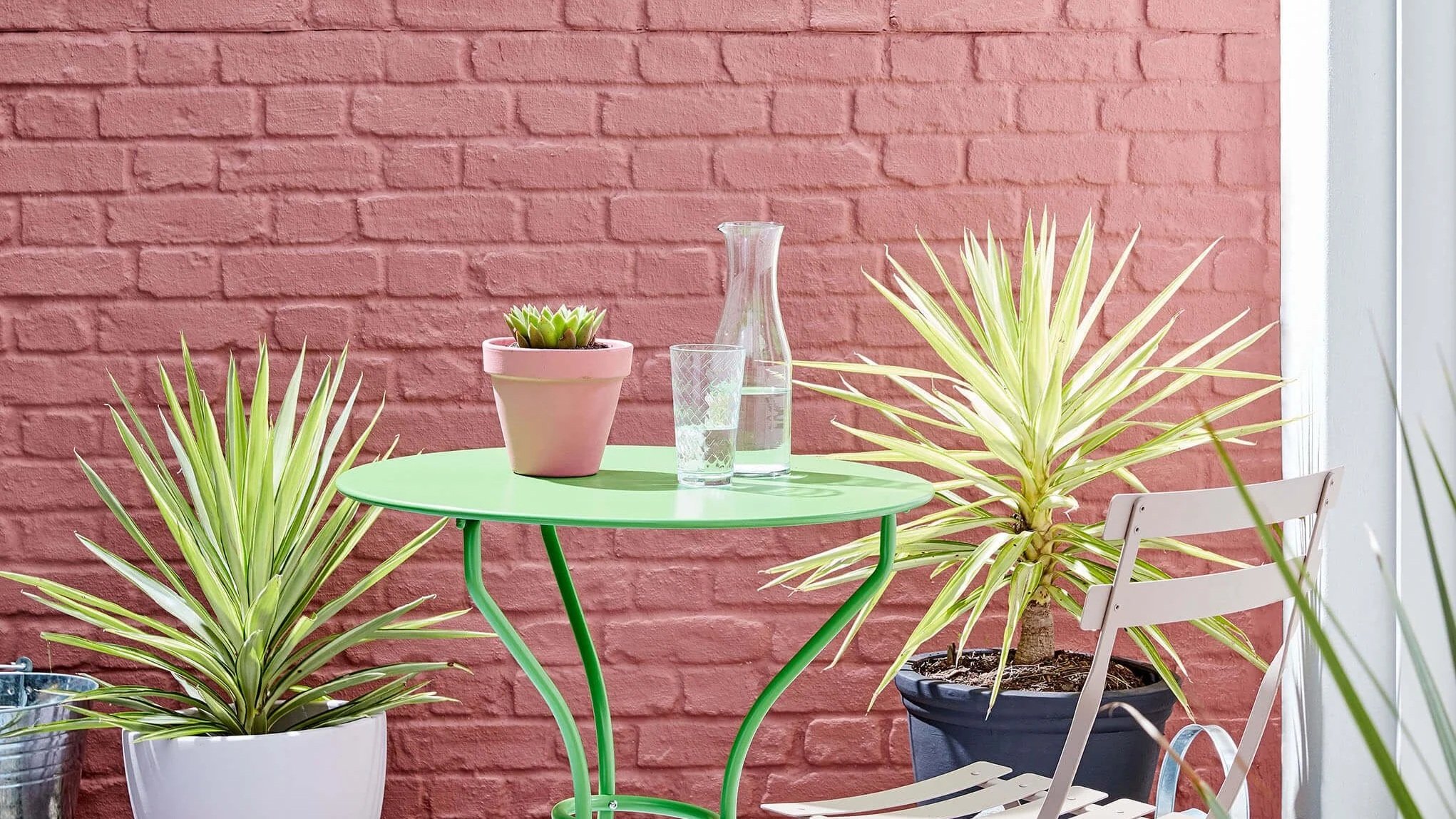
Red & Pink Colours
Red and pink are the colours for homeowners who want a room to make a statement, and Little Greene's range spans from the barely-there warmth of a pale pink to the full, opulent depth of a Georgian dining room red. These are Heritage Home's picks for Chicago clients ready to commit to real colour, wherever their ambition sits on that spectrum.
Muted Reds & Pinks
The dusky pinks and reds that the most sophisticated designers reach for first. Drawn from the rose, ochre and earth pigments of British decorative tradition, these are colours with the character of aged textiles and rooms that have been lived in for generations. Blush, Mochi and Split Pink bring warmth without sweetness — Heritage Home's choice for Chicago dining rooms, studies and entrance halls that need depth and character.

Light Peachblossom No. 3 is a soft warm neutral with the depth and nuance associated with Little Greene’s historic palette, creating depth and warmth while allowing materials and furnishings to lead.

Dorchester Pink No. 213 is a soft warm pink with the depth and nuance associated with Little Greene’s historic palette, adding warmth and lift without becoming overly bright.

Castell Pink No. 314 is a soft warm pink designed to layer effortlessly within tonal colour schemes, bringing mellow light and understated energy to an interior.

Beauvais Lilac No. 29 is a pale warm lilac with the depth and nuance associated with Little Greene’s historic palette, adding warmth and lift without becoming overly bright.

Tuscan Red No. 140 is a deep crimson red with the depth and nuance associated with Little Greene’s historic palette, bringing warmth, wit and a sense of occasion to a room.

Split Pink No. 341 is a mid-tone warm pink, lending walls and woodwork a rich, memorable presence.

Nether Red No. 315 is a mid-tone crimson red with the depth and nuance associated with Little Greene’s historic palette, creating an expressive backdrop for art, antiques and natural wood.

Blush No. 267 is a mid-tone warm pink with the depth and nuance associated with Little Greene’s historic palette, adding a confident, cocooning character without feeling overly formal.

Ashes Of Roses No. 6 is a deep warm pink with the tactile character of historic mineral pigments, lending walls and woodwork a rich, memorable presence.

Arras No. 316 is a deep, earthy red inspired by rare historic wall hangings at Hardwick Hall, bringing a sense of heritage and quiet drama to a room.

Adventurer No. 7 is a regal plum-aubergine with a timeless, reassuring depth that turns dining rooms, bedrooms and studies into intimate retreats.
Bright Reds & Pinks
Strong reds have defined some of the most memorable interiors in British decorating history — and Little Greene's versions carry that history in their pigment formulation. Deep red walls create opulent intimacy in dining rooms and lounges, particularly with focused lighting. Theatre Red and Baked Cherry are the definitive choices. More dynamic shades like Mischief and Leather work best in rooms with energy — the kitchen, the family room, the spaces where life happens.

Heat No. 24 is a deep earthy ochre with the depth and nuance associated with Little Greene’s historic palette, adding warmth and lift without becoming overly bright.

Theatre Red No. 192 is a rich crimson red with a lively, theatrical confidence, adding a confident, cocooning character without feeling overly formal.

Orange Aurora No. 21 is a mid-tone crimson red with the depth and nuance associated with Little Greene’s historic palette, lending walls and woodwork a rich, memorable presence.

Mischief No. 13 is a vivid blue-based pink with a playful, theatrical edge, bringing energy and personality to statement walls, cabinetry and intimate spaces.

Leather No. 191 is a mid-tone crimson red with the depth and nuance associated with Little Greene’s historic palette, adding a confident, cocooning character without feeling overly formal.

Carmine No. 189 is a mid-tone crimson red with the depth and nuance associated with Little Greene’s historic palette, adding a confident, cocooning character without feeling overly formal.

Córdoba No. 277 is a deep, smoky aubergine with a velvety richness that creates a luxurious, cocooning atmosphere.

Bronze Red No. 15 is a rich crimson red with the depth and nuance associated with Little Greene’s historic palette, bringing warmth, wit and a sense of occasion to a room.

Baked Cherry No. 14 is a sumptuous, dark cherry red with a warm, enveloping richness that feels especially dramatic in dining rooms and studies.

Atomic Red No. 190 is an unapologetic primary red with the bold graphic confidence of 1970s decoration, perfect for expressive accents and statement joinery.
Light Reds & Pinks
Pale pinks of real sophistication — drawn from the delicate rose pigments of English decorative painting and completely unlike the flat pastels available anywhere else in the Midwest. Pink Slip and Chemise offer a hue that reads as almost-neutral in certain lights and reveals its full warmth and character in others. The choice for rooms where the ambition is warmth, delicacy and lasting appeal.

Masquerade - Mid No. 333 is a pale earthy ochre with a lively, theatrical confidence, creating a sunlit atmosphere even in spaces with limited natural light.

Masquerade - Light No. 332 is a pale earthy ochre with a lively, theatrical confidence, bringing mellow light and understated energy to an interior.

Masquerade No. 334 is a soft earthy ochre with a lively, theatrical confidence, casting a warm, optimistic glow across the room.

Light Beauvais No. 323 is a pale earthy ochre designed to layer effortlessly within tonal colour schemes, bringing mellow light and understated energy to an interior.

Julie's Dream No. 26 is a pale earthy ochre with the depth and nuance associated with Little Greene’s historic palette, adding warmth and lift without becoming overly bright.

Ferdinand No. 313 is a airy earthy ochre designed to layer effortlessly within tonal colour schemes, bringing mellow light and understated energy to an interior.
Dorchester Pink No. 213 is a soft warm pink with the depth and nuance associated with Little Greene’s historic palette, adding warmth and lift without becoming overly bright.
Beauvais Lilac No. 29 is a pale warm lilac with the depth and nuance associated with Little Greene’s historic palette, adding warmth and lift without becoming overly bright.

Pink Slip No. 220 is a pale warm pink with the depth and nuance associated with Little Greene’s historic palette, adding a confident, cocooning character without feeling overly formal.

Hellebore No. 275 is a soft crimson red with the depth and nuance associated with Little Greene’s historic palette, bringing warmth, wit and a sense of occasion to a room.

Confetti No. 274 is a pale warm pink with the depth and nuance associated with Little Greene’s historic palette, bringing warmth, wit and a sense of occasion to a room.

Chemise No. 139 is a airy warm pink with the depth and nuance associated with Little Greene’s historic palette, bringing warmth, wit and a sense of occasion to a room.
A Palette to Inspire
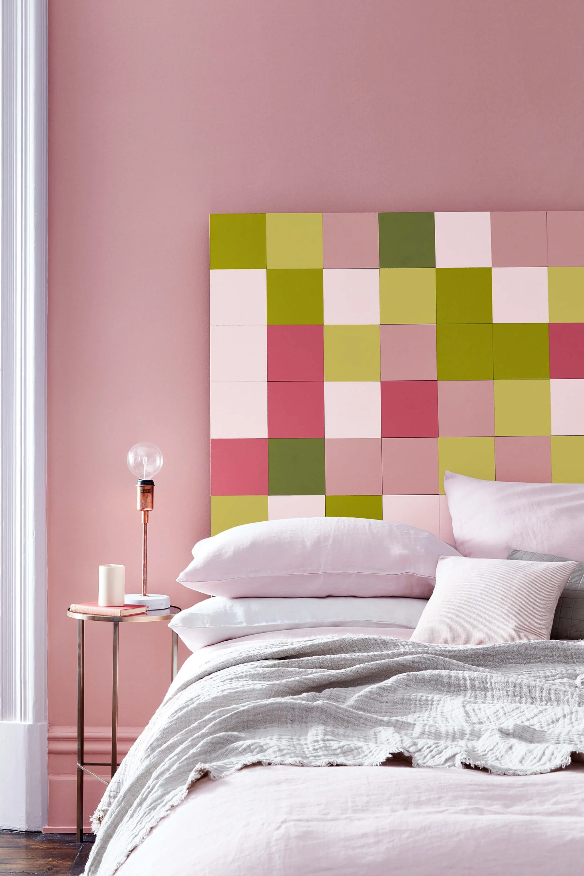
Walls:
Hellebore (275)
Headboard:
Pink Slip (220)
Headboard:
Carmine (189)

Headboard:
Citrine (71)

Headboard:
Olive Colour (72)
Mochi No. 344 is a mid-tone warm neutral with the comforting richness suggested by its culinary name, creating depth and warmth while allowing materials and furnishings to lead.