
Regency Paint Colours
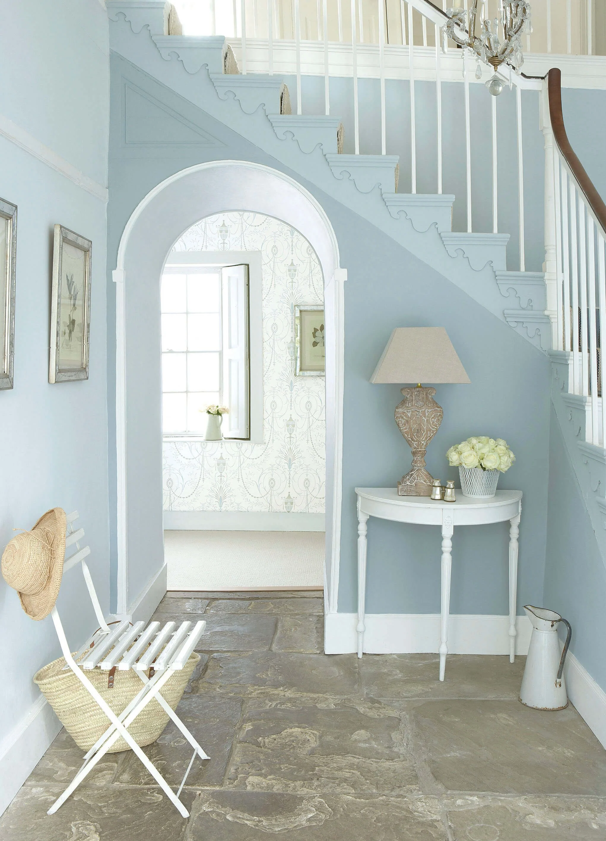
The Regency era threw the rulebook out — and replaced it with a better one. Richer yellows, deep drabs, and confident greens arrived as a deliberate counterpoint to Georgian restraint. Interiors became more layered, more dramatic, more personal. In Chicago, you'll find this spirit in the formal parlours of Lincoln Park's oldest surviving rowhouses and the detailing of early Gold Coast interiors.
Little Greene's Regency palette captures the era's defining move — serious colour, worn with complete confidence. These are period paint colours that earn their place in any historic Chicago home.

Blue Verditer No. 104 is a mid-tone heritage blue with the depth and nuance associated with Little Greene’s historic palette, giving walls and joinery a calm, architectural confidence.

Green Verditer No. 92 is a mid-tone natural green with the depth and nuance associated with Little Greene’s historic palette, adding natural depth to walls, cabinetry and architectural details.

Light Peachblossom No. 3 is a soft warm neutral with the depth and nuance associated with Little Greene’s historic palette, creating depth and warmth while allowing materials and furnishings to lead.

Yellow-Pink No. 46 is a distinctive ochre-pink with an earthy Georgian warmth, creating richly layered rooms alongside deep greens and warm neutrals.

Galette No. 340 is a deep warm neutral with the comforting richness suggested by its culinary name, creating depth and warmth while allowing materials and furnishings to lead.

Celestial Blue No. 101 is a softly weathered blue discovered on a rare surviving colour card from 1807, with a beautifully restrained historic character.

Pea Green No. 91 is a mid-tone yellow-green with the depth and nuance associated with Little Greene’s historic palette, adding natural depth to walls, cabinetry and architectural details.
A Palette to Inspire
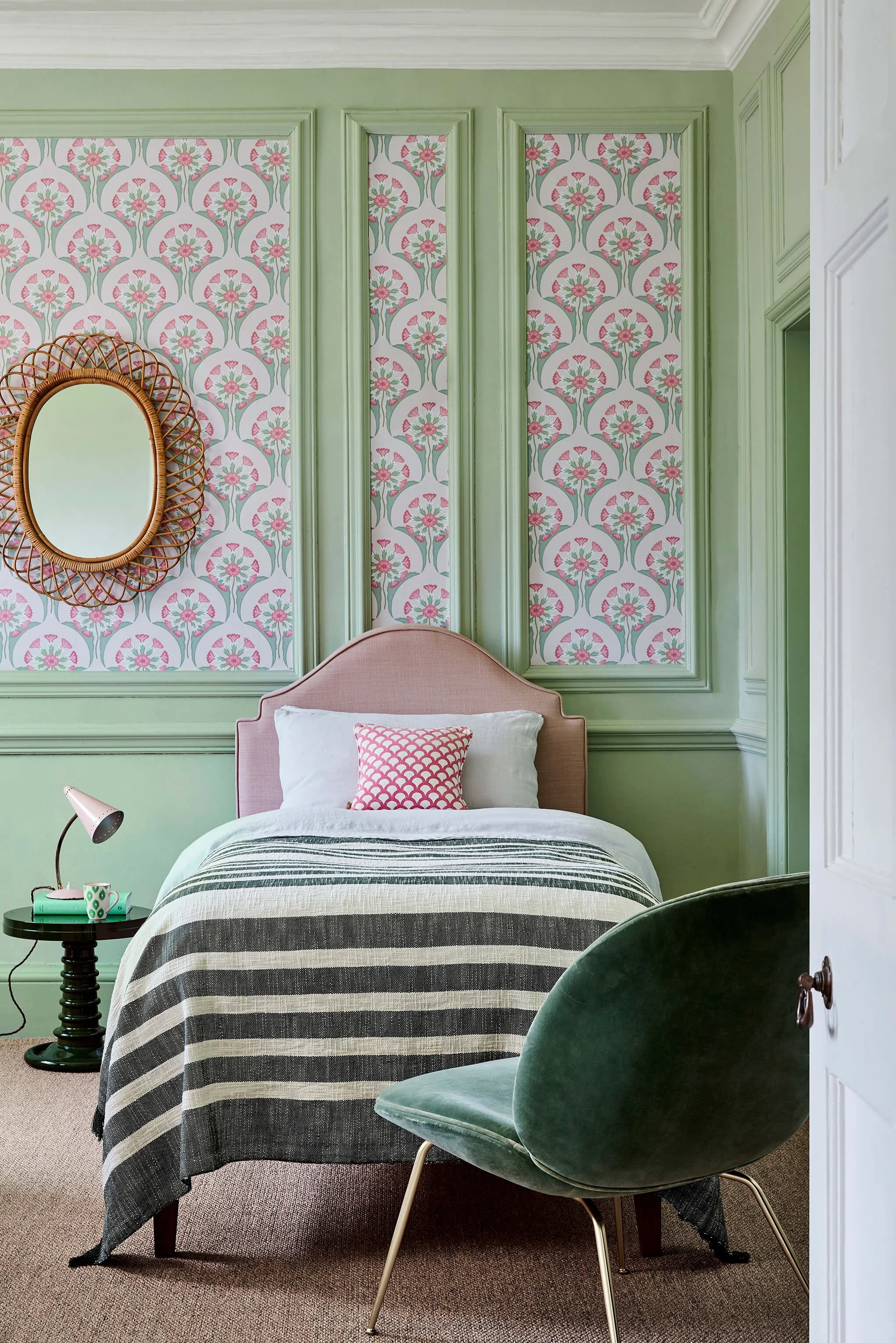

Walls:
Pea Green 91

Decorative Trim:
Sky Blue 103
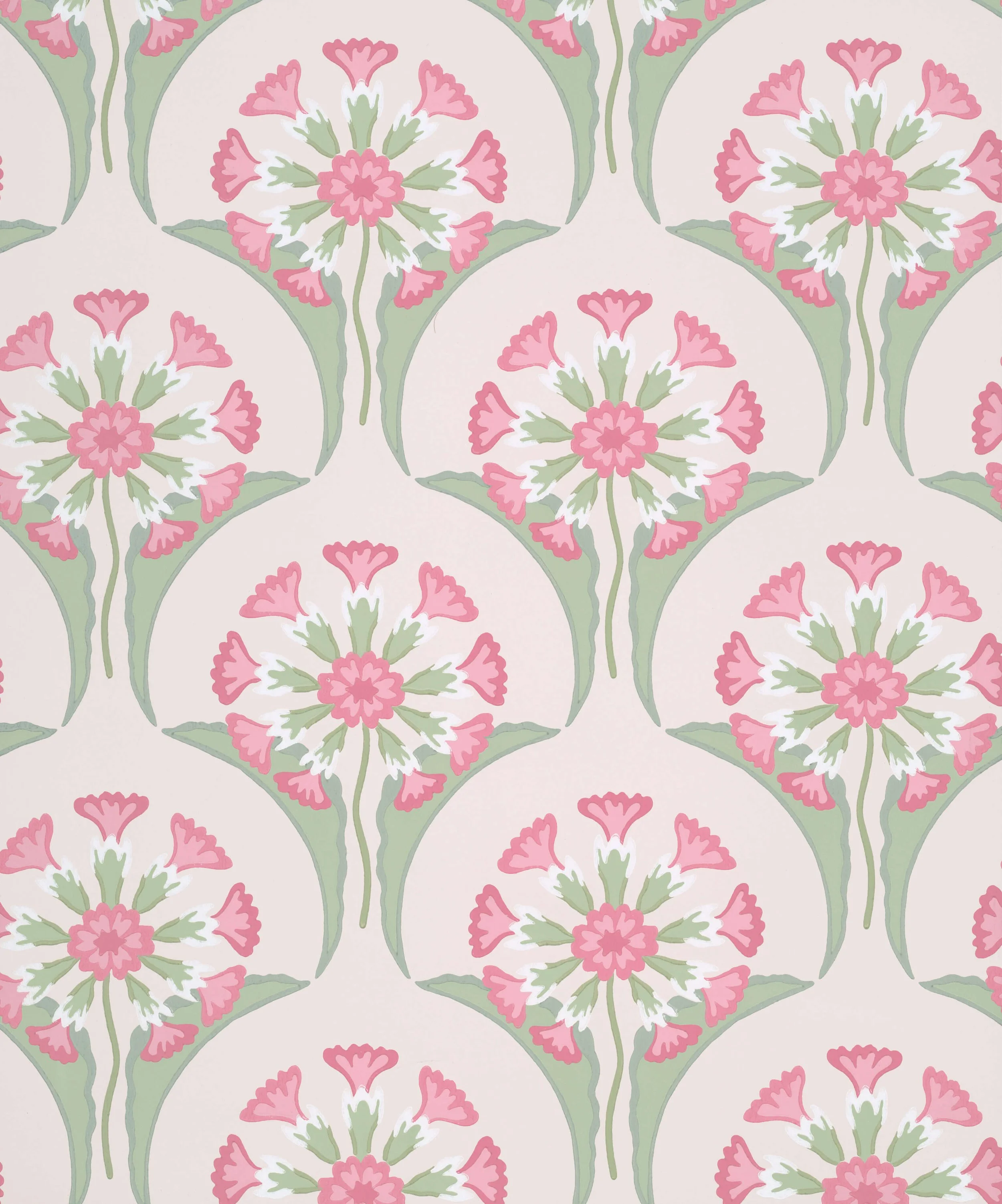
Wallpaper
Hencroft Pink Primula