
Victorian & Edwardian Colours
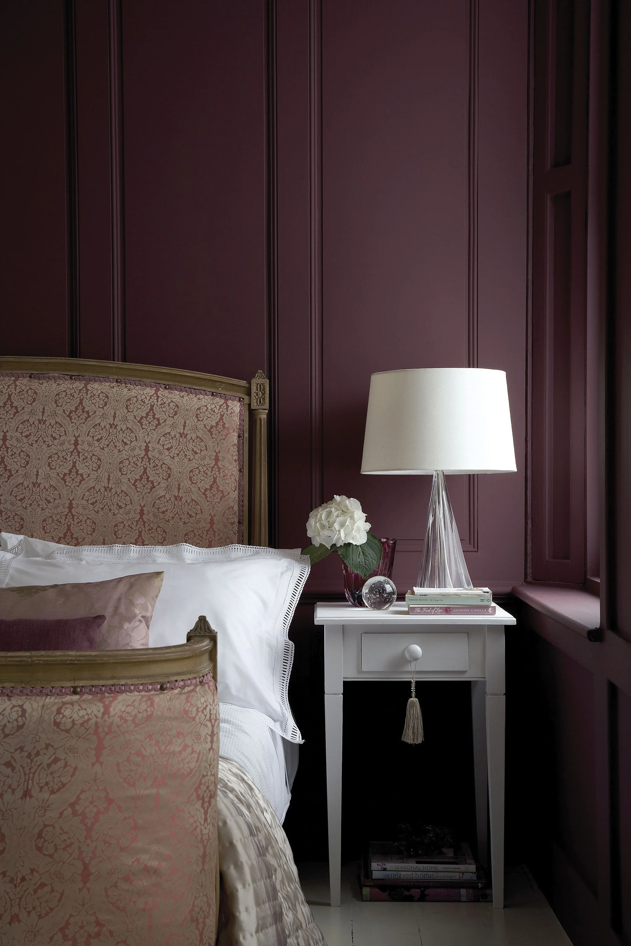
Chicago is a Victorian city. The greystones of Lincoln Square, the two-flats of Lakeview, the coach houses of Andersonville, and the ornate bay-windowed buildings running the length of the North Side. The vast majority of Chicago’s most beloved residential architecture was built between 1880 and 1910, in direct conversation with the Victorian and Edwardian decorating traditions of Britain.Victorian Chicago built itself in colour — deep reds, forest greens, and warm ochres covering the greystones, two-flats, and gabled cottages that still define entire neighborhoods today. As the city rebuilt after the Great Fire, this was the palette of ambition: richer, darker, and more deliberate than anything that came before it. Little Greene’s Victorian and Edwardian range is drawn from the same pigment archives as the originals, making it the most historically accurate choice for restoring a Chicago greystone or two-flat — colours no mass-produced alternative can replicate.

Purple Brown No. 8 is a dramatic crimson red designed to layer effortlessly within tonal colour schemes, creating an expressive backdrop for art, antiques and natural wood.

Ganache No. 345 is a rich warm neutral with the comforting richness suggested by its culinary name, offering a quiet backdrop with enough character to avoid feeling flat.

Ambleside No. 304 is a muted blue-green inspired by the layered interiors of Beatrix Potter’s Hill Top farmhouse, with a restful, quietly historic character.

French Grey No. 113 is a serene, timeless neutral with subtle green undertones, equally at home in elegant period rooms and clean contemporary interiors.

Sage Green No. 80 is a muted, herbal green with a soft greyed undertone, bringing an easy, restorative calm to layered interiors.

Bronze Red No. 15 is a rich crimson red with the depth and nuance associated with Little Greene’s historic palette, bringing warmth, wit and a sense of occasion to a room.

Bath Stone No. 64 is a mid-tone mineral neutral with the tactile character of historic mineral pigments, creating depth and warmth while allowing materials and furnishings to lead.

Ashes Of Roses No. 6 is a deep warm pink with the tactile character of historic mineral pigments, lending walls and woodwork a rich, memorable presence.

Light Gold No. 53 is a mid-tone golden yellow with the depth and nuance associated with Little Greene’s historic palette, casting a warm, optimistic glow across the room.

Portland Stone No. 77 is a soft mineral neutral with the tactile character of historic mineral pigments, offering a quiet backdrop with enough character to avoid feeling flat.

Dark Brunswick Green No. 88 is a traditional near-black green with a polished, stately character, ideal for doors, cabinetry and exterior details.

Light Bronze Green No. 123 is a rich earthy ochre with the depth and nuance associated with Little Greene’s historic palette, casting a warm, optimistic glow across the room.

Ferdinand No. 313 is a airy earthy ochre designed to layer effortlessly within tonal colour schemes, bringing mellow light and understated energy to an interior.

Hopper No. 297 is a deep yellow-green with an organic, garden-inspired character, bringing the restorative character of the landscape indoors.

Pompeian Ash No. 293 is a deep atmospheric neutral with the tactile character of historic mineral pigments, bringing the restorative character of the landscape indoors.

Three Farm Green No. 306 is a rich heritage blue designed to layer effortlessly within tonal colour schemes, creating a poised backdrop that shifts beautifully with the light.
A Palette to Inspire
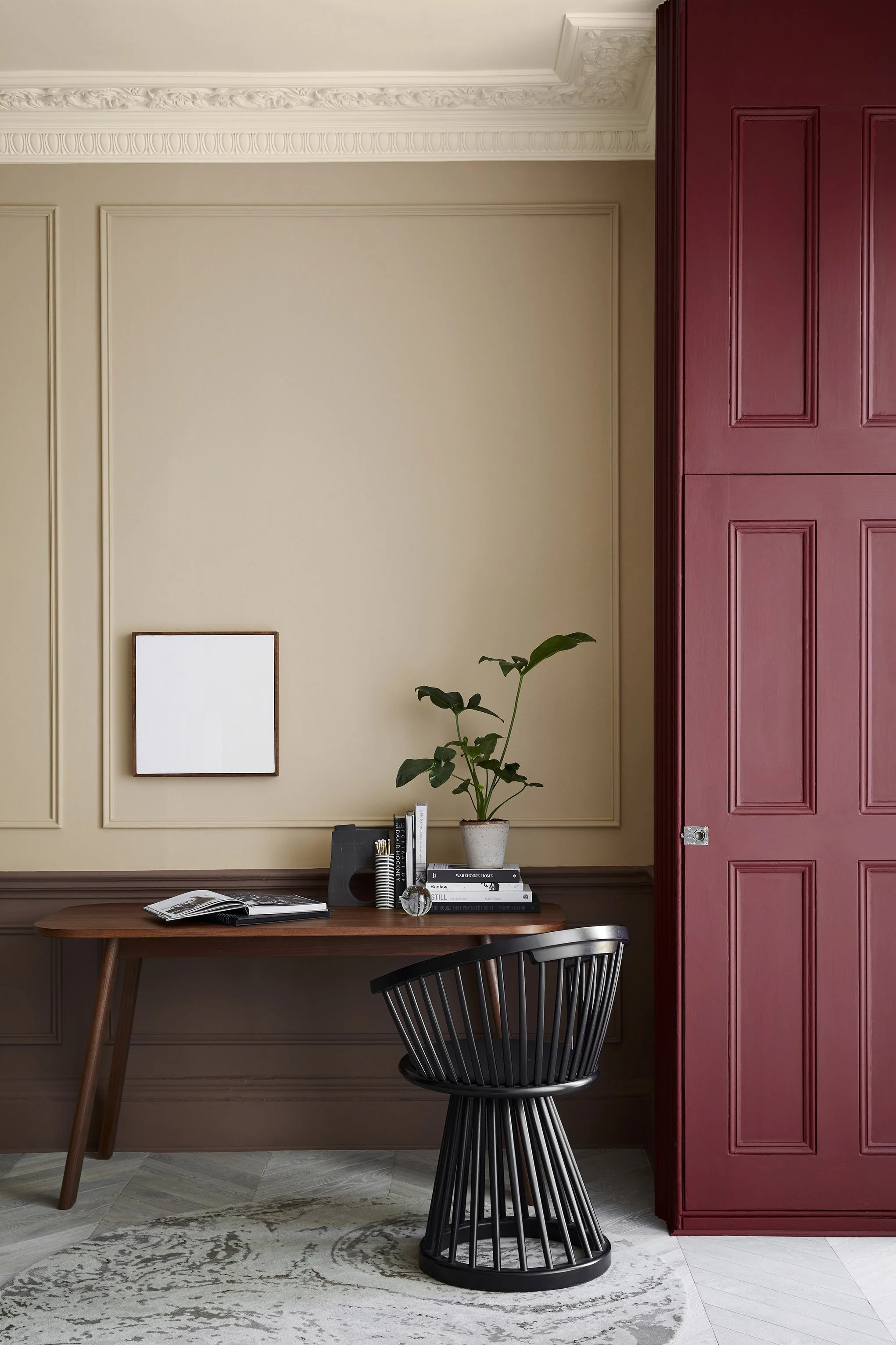

Walls:
Castell Pink 314

Wainscotting:
Arras 316

Cabinetry:
Nether Red 315

Ceiling:
Ferdinand 313