
-
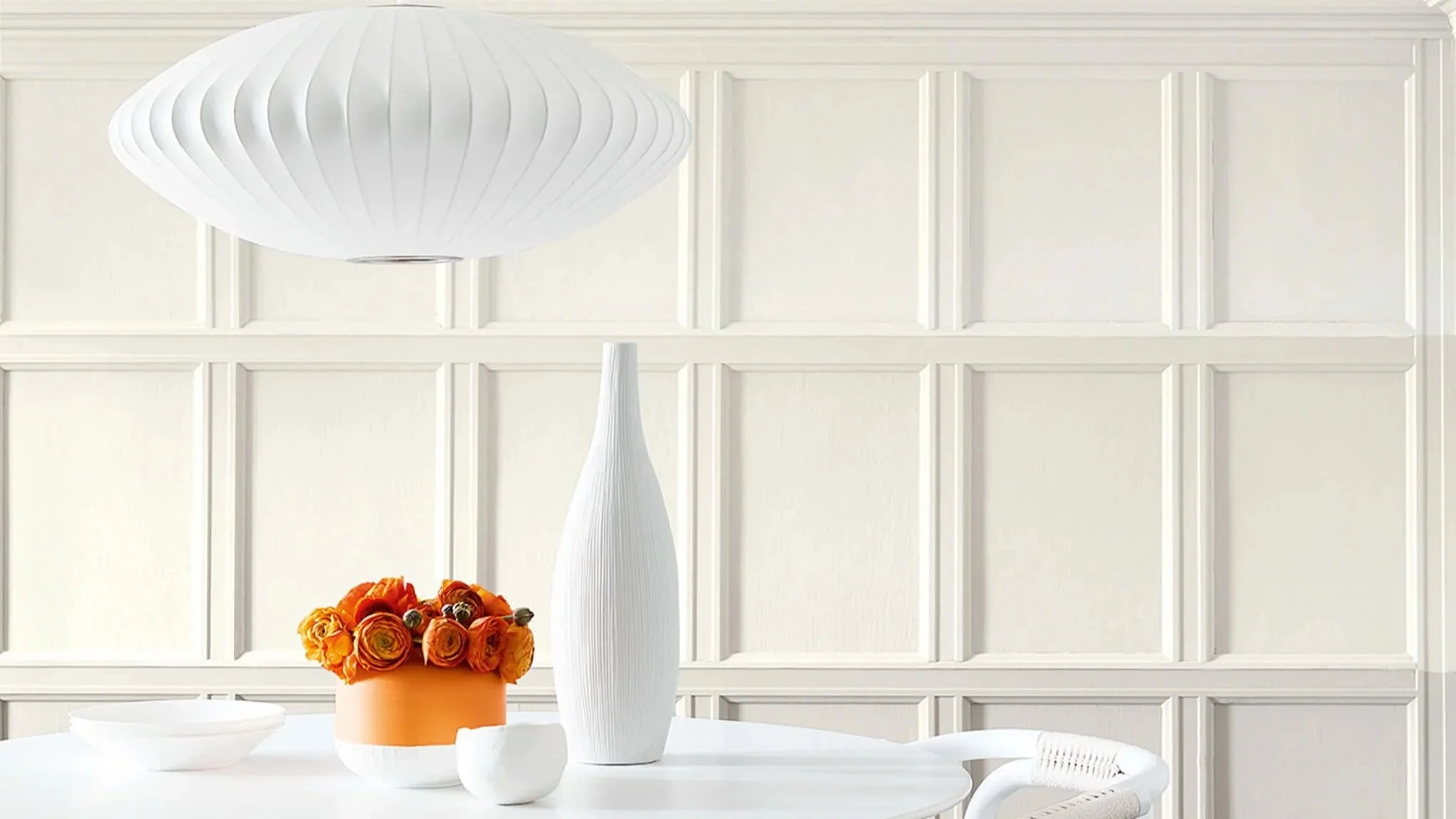
White Paint Colours
White is rarely just white in the Little Greene range — each shade carries an undertone drawn from three centuries of pigment tradition, from warm yellow to cool blue-grey. Chicago's light shifts dramatically with the seasons, so choosing the right undertone matters more here than almost anywhere else, and it's the question Heritage Home fields most often from clients starting a whole-home scheme.
Warm Whites with Yellow or Umber
The warmest end of the white spectrum — these are the whites that make a room feel sun-filled even on a grey Chicago morning. White Lead and First Light have the most vibrancy. Stock and Linen Wash offer a softer, more mineral character. All are formulated with the pigment complexity that distinguishes Little Greene from every paint brand available in this city.

Travertine - Light No. 272 is a pale mineral neutral with the tactile character of historic mineral pigments, casting a warm, optimistic glow across the room.

Stock No. 37 is a airy mellow yellow with the depth and nuance associated with Little Greene’s historic palette, creating a sunlit atmosphere even in spaces with limited natural light.

Linen Wash No. 33 is a airy atmospheric neutral with the tactile character of historic mineral pigments, creating a sunlit atmosphere even in spaces with limited natural light.

Hollyhock No. 25 is a airy earthy ochre with the depth and nuance associated with Little Greene’s historic palette, bringing mellow light and understated energy to an interior.

First Light No. 49 is a airy mellow yellow with the depth and nuance associated with Little Greene’s historic palette, creating a sunlit atmosphere even in spaces with limited natural light.

Clay - Pale No. 152 is a pale mineral neutral with the tactile character of historic mineral pigments, casting a warm, optimistic glow across the room.

Clay - Mid No. 153 is a pale mineral neutral with the tactile character of historic mineral pigments, adding warmth and lift without becoming overly bright.

China Clay - Mid No. 176 is a pale mineral neutral with the tactile character of historic mineral pigments, creating a sunlit atmosphere even in spaces with limited natural light.

Whitening No. 41 is a airy mineral white with the depth and nuance associated with Little Greene’s historic palette, softening a room while keeping it light, calm and considered.

White Lead No. 74 is a warm historic white with a soft, chalky depth, ideal for creating quiet tonal schemes without the glare of brilliant white.

Silent White - Pale No. 328 is a airy mineral white designed to layer effortlessly within tonal colour schemes, bringing gentle clarity to walls, ceilings and woodwork.

Silent White No. 329 is a airy mineral white designed to layer effortlessly within tonal colour schemes, bringing gentle clarity to walls, ceilings and woodwork.
Whites with a Dash of Pink
Pink undertones transform a white into something altogether more welcoming and alive. China Clay and Julie's Dream sit at the heart of this family — whites that harmonise with almost any colour scheme and make every room feel instinctively right. Drawn from the rose pigments of English decorative painting, these are the whites that designers reach for when they want warmth without colour.

Rolling Fog - Pale No. 158 is a pale atmospheric neutral designed to layer effortlessly within tonal colour schemes, casting a warm, optimistic glow across the room.

Light Beauvais No. 323 is a pale earthy ochre designed to layer effortlessly within tonal colour schemes, bringing mellow light and understated energy to an interior.

Julie's Dream No. 26 is a pale earthy ochre with the depth and nuance associated with Little Greene’s historic palette, adding warmth and lift without becoming overly bright.

Ferdinand No. 313 is a airy earthy ochre designed to layer effortlessly within tonal colour schemes, bringing mellow light and understated energy to an interior.

Down No. 242 is a pale earthy ochre designed to layer effortlessly within tonal colour schemes, bringing mellow light and understated energy to an interior.
China Clay - Mid No. 176 is a pale mineral neutral with the tactile character of historic mineral pigments, creating a sunlit atmosphere even in spaces with limited natural light.

China Clay No. 1 is a airy mineral neutral with the tactile character of historic mineral pigments, casting a warm, optimistic glow across the room.
Neutral Whites
The purest whites in the Little Greene palette — complex, considered and full of character. French Grey — Pale and Slaked Lime contain multiple pigments drawn from British mineral and lime traditions that provide depth without perceptible colour. These are the whites for rooms where the architecture makes the statement and the walls need to support it with grace.

Wood Ash No. 229 is a pale atmospheric neutral with the tactile character of historic mineral pigments, creating a sunlit atmosphere even in spaces with limited natural light.

Slaked Lime - Mid No. 149 is an airy warm grey with the tactile character of historic mineral pigments, bringing architectural definition without the severity of a true black.
Rolling Fog - Pale No. 158 is a pale atmospheric neutral designed to layer effortlessly within tonal colour schemes, casting a warm, optimistic glow across the room.

Portland Stone - Pale No. 155 is a pale mineral neutral with the tactile character of historic mineral pigments, creating depth and warmth while allowing materials and furnishings to lead.

French Grey - Pale No. 161 is a pale warm grey designed to layer effortlessly within tonal colour schemes, bringing architectural definition without the severity of a true black.

French Grey - Mid No. 162 is a pale warm grey designed to layer effortlessly within tonal colour schemes, creating a tailored backdrop that responds subtly to changing light.

Flint No. 236 is a airy earthy ochre with the tactile character of historic mineral pigments, creating a sunlit atmosphere even in spaces with limited natural light.

Shirting No. 129 is a airy mineral white with the depth and nuance associated with Little Greene’s historic palette, providing a luminous foundation for layered tonal schemes.

Loft White No. 222 is a airy mineral white with the depth and nuance associated with Little Greene’s historic palette, creating a nuanced alternative to a stark, brilliant white.

Gauze No. 106 is a airy balanced white with the depth and nuance associated with Little Greene’s historic palette, bringing gentle clarity to walls, ceilings and woodwork.

Slaked Lime No. 105 is a warm, chalky white with the soft mineral character of traditional limewash, creating a gentle and timeless backdrop.
Whites with a Touch of Green
Green-undertoned whites are among the most sought-after in contemporary interior design — and Little Greene has been perfecting them for decades. Green Stone and Pearl Colour bring a softness and naturalism rooted in the stone and verdant pigments of the English landscape. Beautiful in bedrooms, living spaces and throughout Chicago's finest restored historic properties.

Pearl Colour-Pale No. 167 is a pale yellow-green designed to layer effortlessly within tonal colour schemes, bringing the restorative character of the landscape indoors.

Pearl Colour-Mid No. 168 is a pale yellow-green designed to layer effortlessly within tonal colour schemes, feeling restful by day and richly atmospheric after dark.

Green Stone - Pale No. 268 is a pale mineral neutral with the tactile character of historic mineral pigments, creating a sunlit atmosphere even in spaces with limited natural light.

Green Stone - Light No. 269 is a pale mineral neutral with the tactile character of historic mineral pigments, giving rooms an understated, beautifully layered foundation.

Aquamarine - Pale No. 282 is a airy natural green with a clear, atmospheric quality, bringing the restorative character of the landscape indoors.
A Palette to Inspire
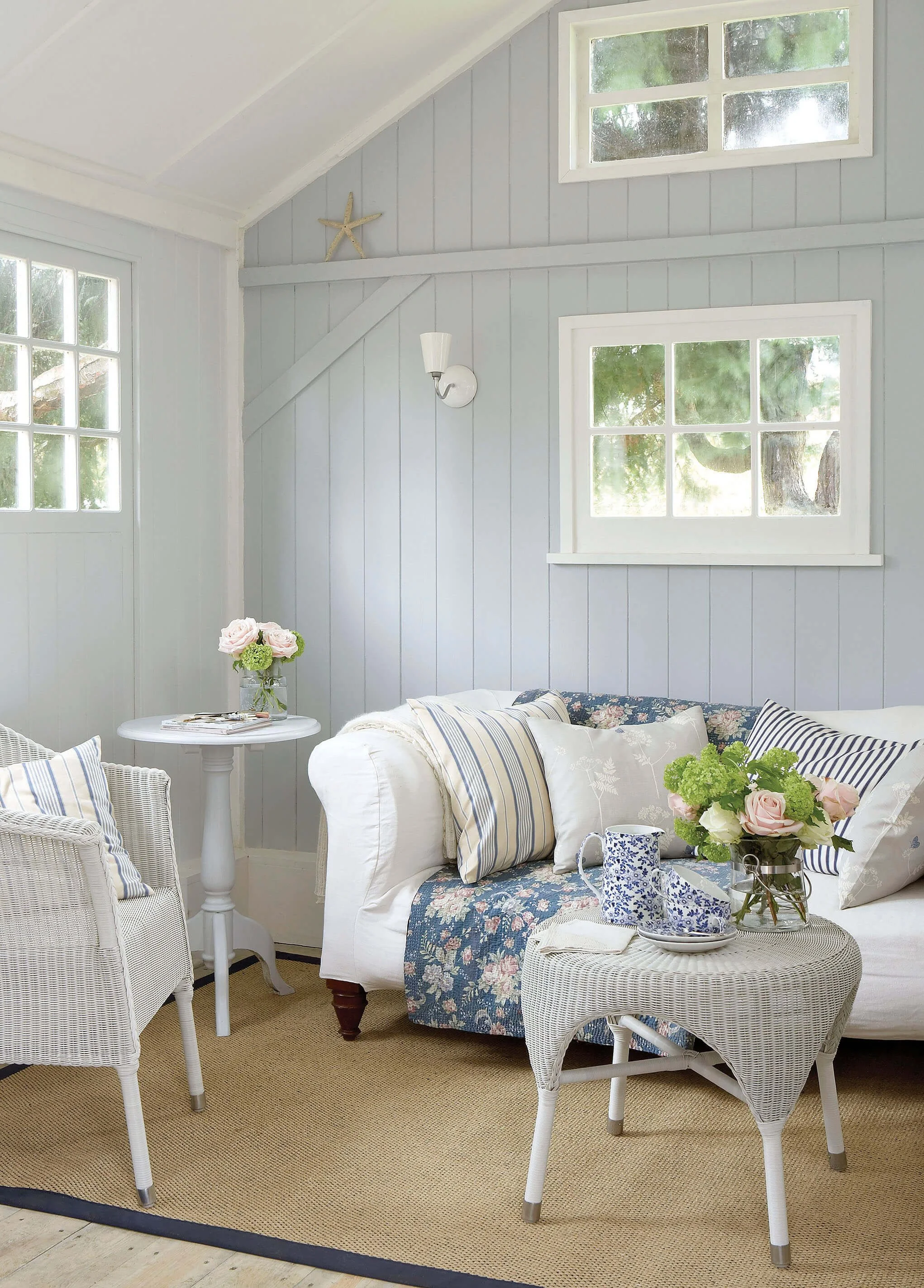
Walls:
Gauze (106)

Walls:
Gauze - Dark (166)
Trim:
Shirting (129)
Silent White - Mid No. 330 is a pale mineral white with the depth and nuance associated with Little Greene’s historic palette, providing a luminous foundation for layered tonal schemes.